


You can add Instagram feed almost anywhere in Magento 2 using widgets. Below you can find detailed information about Instagram feed widget settings and how to add it in different locations on your Magento 2 store.
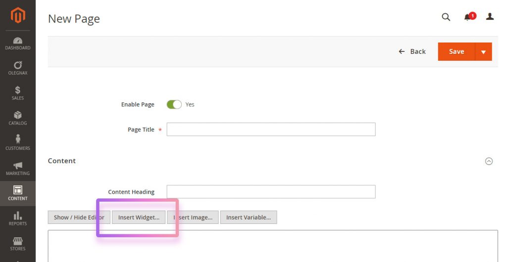
How to add Instagram Feed widget to content
Please check this article to learn How To Use/Insert Widgets In Magento 2
In short, you can add Widgets via Content / Widgets or by clicking Insert Widget button in any content editor. After that choose Olegnax – Instagram Feed Pro as widget type. Adjust settings and click Insert Widget.
How to add Instagram Feed widget to Product Page
- Navigate to Olegnax > Instagram Pro : Settings > Product Page
- Choose desired location Custom Block Position
- Click Insert Widget button in either first or second content areas.
- Choose Olegnax – Instagram Feed Pro as widget type.
- Adjust settings and click Insert Widget
- Enable Show Product Related Posts Only in widget settings if you want to show only Instagram posts which are linked to current product.
For more details check Extension Settings
Instagram Feed Widget Settings
Post Owner – this is your Instagram account. You can add multiple Instagram account and so you can choose posts from which accounts to show in each widget.
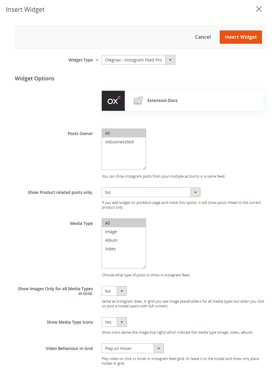
Show Product Related Posts Only – this option is for product page only. Add Instagram widget to the product page and enable this option to show only posts that are linked/related to the current product. You can set related products to a post in a Olegnax > Instagram Pro : Posts
This option has 3 conditions:
- (No) Show all posts
- (Yes) Show only related posts only. If there is no related posts for specific product then nothing will be shown.
- (Show all posts if there are no related posts) Show related posts and if there is no related posts for specific product then show all posts.
Media Type – you can choose what type of Instagram posts to show in a feed. For example you can show only images and skip posts with video.
Show Images Only for all Media Types in Grid – by default you will see video and carousel slider for album posts directly in feed. You can enable this option to show images for all media types in feed. The original media content will be still available in a modal. This option is useful for carousel feeds (because you can get carousel in a carousel) or if you want to make Instagram feed lighter.
Show Media Type Icons – these icons are in a top right corner of each feed item, indicating type of post content. For example you can see play icon in a top right corner for video posts and so you know what you need to click/hover this post to view video.
Video Behavior in Grid – you can choose to play video on click or hover directly in a grid. Or don’t play it in a grid at all and play it only in a modal.
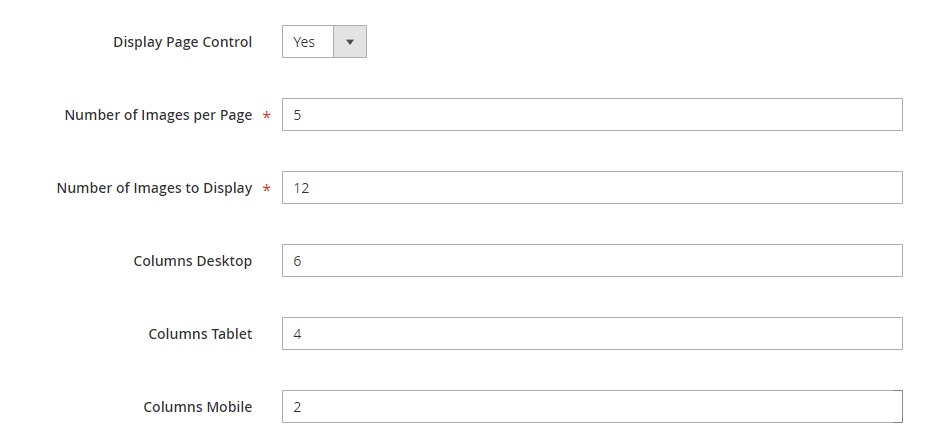
Display Page Control – enable this options to show pagination and limit amount of ports shown per page. This option is not available if you enable Carousel.
Number of Images per Page – set the max amount of posts per page.
Number of Images to Display – total amount of posts that will be displayed.
If you enabled pagination and want to have two pages with 10 images/posts on each page then set 10 for Number of Images per Page and 20 for Number of Images to Display.
Columns
You can set different amount of columns for Instagram feed widget grid for desktop, table and mobile. By default tablet is below 1024px and mobile – below 639px but you can change these values in the advanced settings described further below.
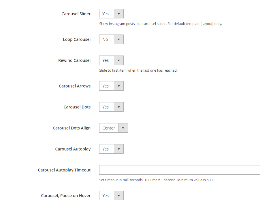
Carousel Slider
You can show Instagram feed in a carousel instead of a simple grid. You can adjust basic set of carousel options like loop, rewind (scroll back to first item, better for performance than loop), enable navigation arrows and dots, autoplay and stop autoplay when you hover mouse over the item.
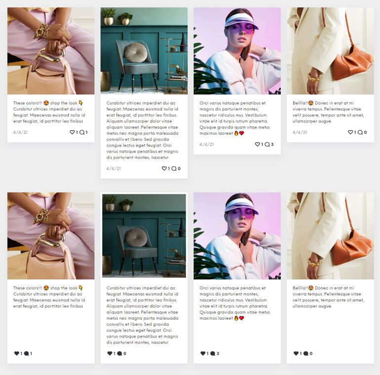
Grid layouts
You can choose from various predefined layouts for Instagram feed grid.
Note that following options are disabled if carousel is enabled.
Grid Layout: First Image Big will render first image 4x bigger than other images.
Grid Layout: Every Nth Image Big this layout adapts to the grid columns. It will render first and every nth image 4x bigger. If you set 4 columns grid layout then first image will be big, then 4 normal items and then big item and so on. You can check examples of how it works here: https://instagram-feed-magento2.olegnax.com/#grid-layouts
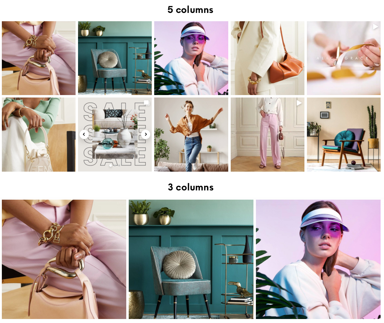
Below you can see example of 4 and 5 columns Every Nth Image Big layouts:


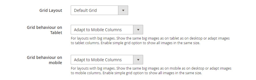
You can change this behavior for tablet and mobile:
Adapt to Mobile Columns – if you have 4 columns on desktop and 3 columns on tablet with this option, you will have different big images for tablet and mobile because it will be 1+4+1+4… and 1+3+1+3+1… But if you set behavior option to Same Items as on Desktop, then it will keep the same images big as on desktop, no matter how many columns you have on mobile/tablet.
You can additionally show only first image as big or all images as normal on mobile/tablet for Every Nth Image Big grid.
Below are examples of Adapt to Mobile Columns with 3 columns and Only first image is big for mobile.

Feed items box styles
Following settings can help you drastically change the look of your Instagram feed.
You can check some examples of what you can achieve here: https://instagram-feed-magento2.olegnax.com/feed-item-styles
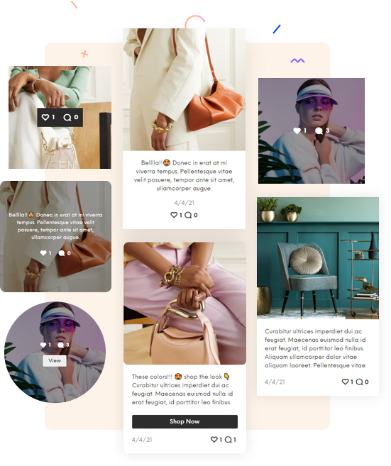
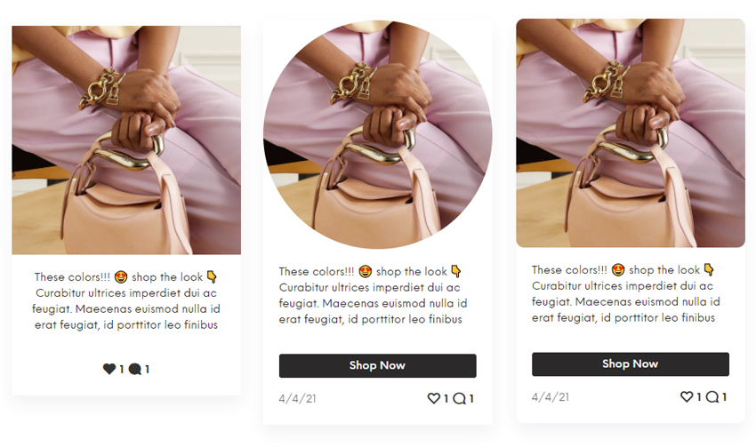
Item Style – this is a layout option for feed item box. This is where you choose position of a content, for example below or above the image on hover only. Image above demonstrates different item layouts.
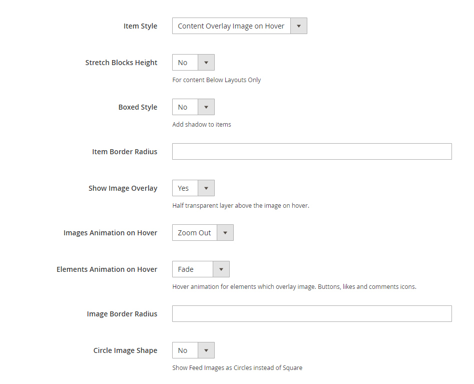
Stretch Block Height – this option is for layouts where content is below the image. By default height if the items will be same of its content. If this option is enabled then all items will have the same height by the tallest item.
Boxed Style – enable to add shadow to the item block. Like on images above or below.
Item Border Radius and Image Border Radius allows to change roundness of the item box and image edges. Set 0 for sharp edges. Set half of the image height/width for circle or you can simply enable Circle Image Shape if you want to change images shape to circles.
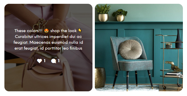
Show Image Overlay – enable (usually half transparent) layer which overlay image on hover. Usually used when content is shown above the image (See image below for example). You can change overlay color in Appearance settings.
Elements Animation on Hover – means content element: comment and like count icons, button, etc. This options is for layouts when content appear on hover. Like on image above.
Elements
You can show/hide each element in Instagram feed.
Note that you can also hide each item for mobile only. This is useful when you have a lot of content on hover on desktop which would not fit in item container on a small screen. See image below for example.
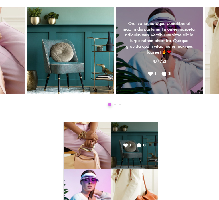
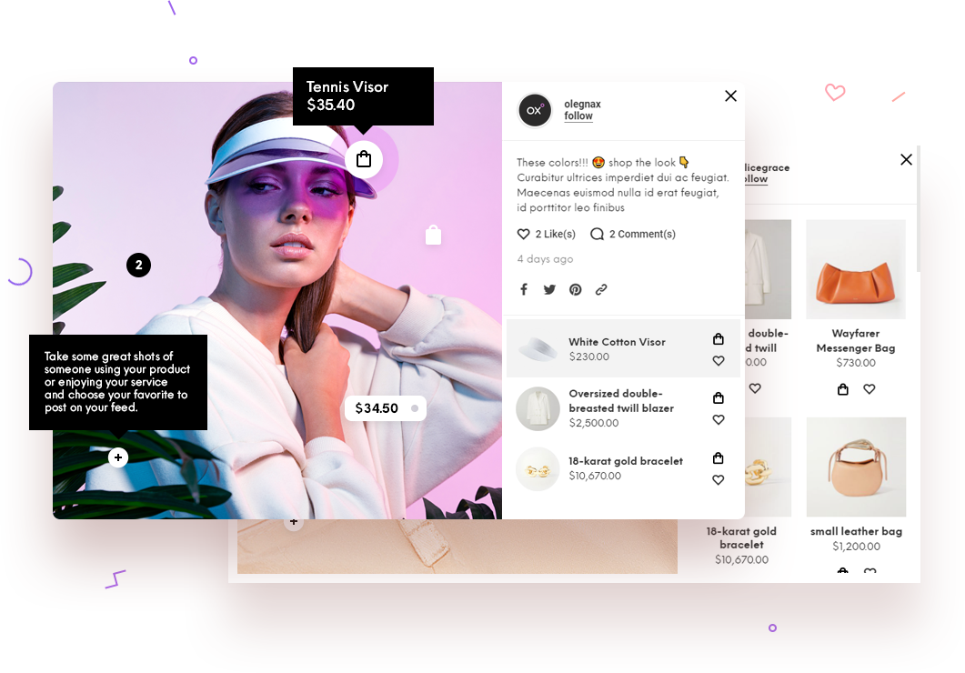
Show Zero Counts (Likes and Comments) – if enabled, like and comment icons will still be shown but with 0 as text. As on mobile view on image above. If disabled icons and text will not be displayed for zero values. So in example above there would be only icon with like and no icon for comments.
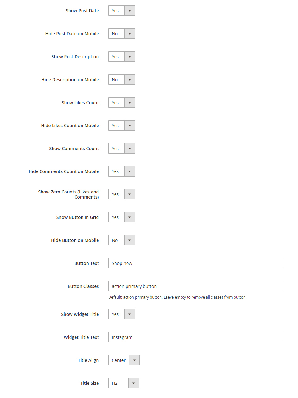
Button – this is a visual element for call to action. You can’t add a link specifically for this button. Action on click is set to the entire item.
Button Classes – you may want to change this classes to fit your theme style in case your theme uses its own classes for buttons.
Widget Title – is a title for entire feed block. It is shown before the widget.
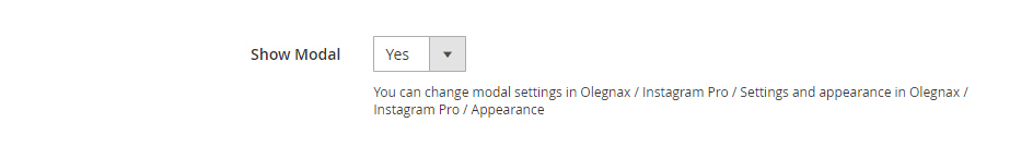
Modal
This option will enable modal which appears when you click on item in feed. If disabled, appropriate Instagram page will be opened on item click.
You can adjust modal settings in Olegnax > Instagram Pro : Settings > Modal and colors and styles in Olegnax > Instagram Pro : Appearance > Modal
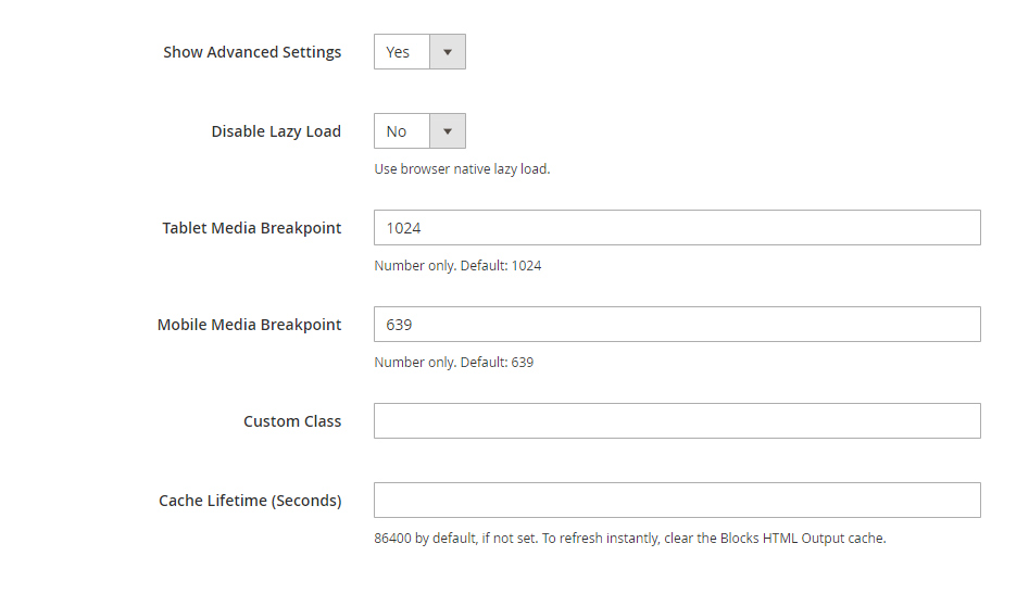
Advanced Settings
You can disable Olegnax lazy load for specific Instagram widget. If you want to disable our lazy load completely then you can do it in core extension settings Olegnax > Core Settings
Tablet and Mobile breakpoints – you should understand what this is for before changing it. This will affect some of the options, e.g.: grid columns. You may want to adjust it to your theme breakpoints.
Custom class – you can add custom css class to make some additional adjustments to specific widget.
Cache lifetime – you will not get new data(new posts, likes count, etc.) in widget if it is cached but if you disable it completely it will affect performance so change it only if you know what you are doing.