


You can find Olegnax Instagram Feed Pro extension appearance settings in Olegnax menu on the left side, in your Magento 2 admin panel: Olegnax > Instagram Pro : Appearance
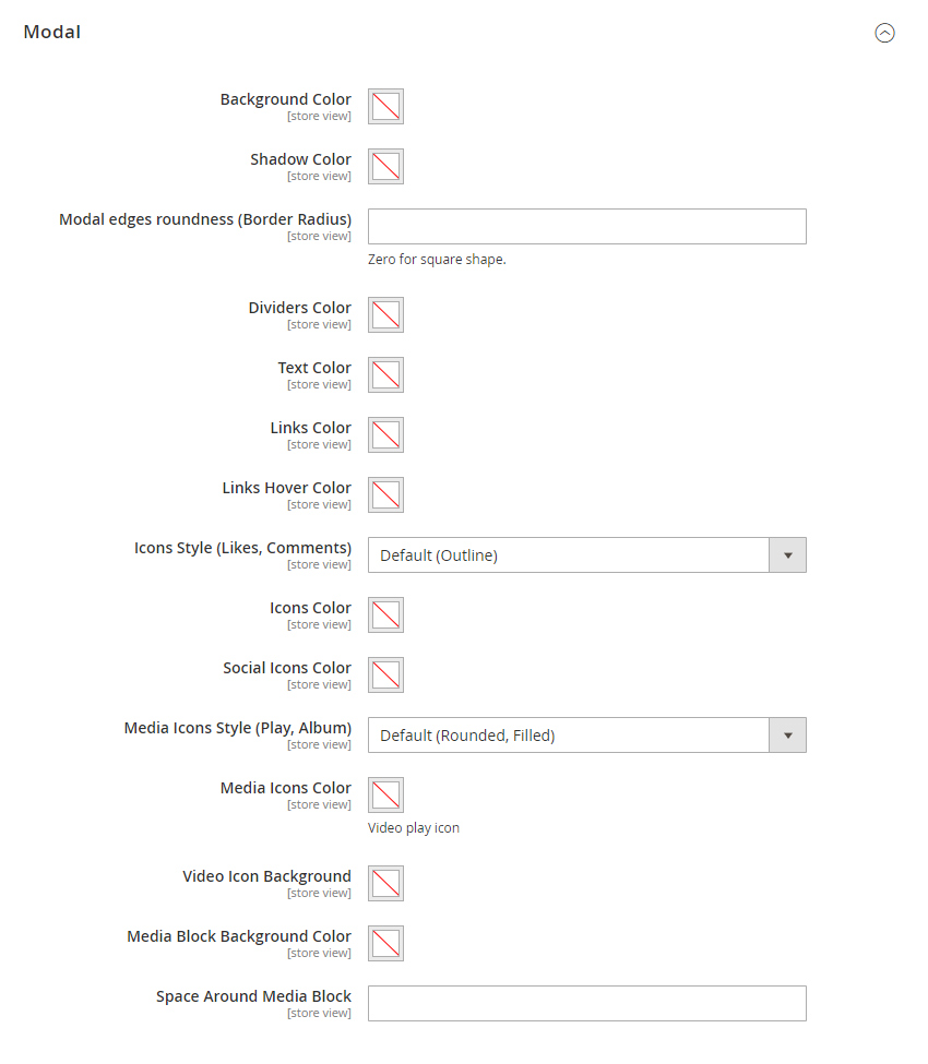
These are settings which allows to change colors and styles for different extension elements globally. Means that these settings will be applied to all Instagram widgets. Note that you can also change some of the settings locally, e.g. change colors and styles for specific hotspot and tooltips.
General Settings
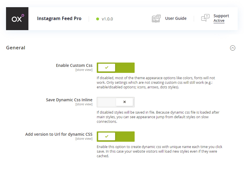
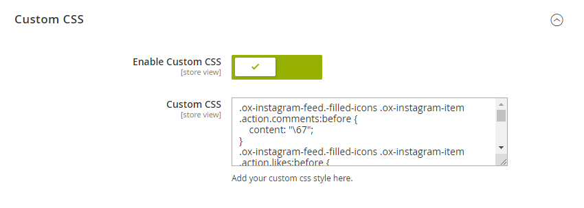
Enable Custom Css – this option is responsible to dynamic css file. All of the extension appearance options are written in this dynamic css so if you disable it then none of the extension appearance options will work. You may want to disable this option if you(or your theme) made your own css for this extension.
Save Dynamic CSS Inline – you can save dynamic css either in a file or directly in html (inline). Which option to choose depends on how you use this extension. A file create additional request so if you have changed a few settings then generate a new file is an overkill and probably will be better to save it inline. But if you have changed a lot of appearance settings then request is less important.
Add version to Url for dynamic CSS – this will help you in fight against the cache. We strongly recommend to keep it enabled. Each time you save settings a new value will be added to CSS URL so browsers will know that the file was changed and will serve new version instead of a cached result.
Feed
Feed settings are general settings for the Instagram widget.
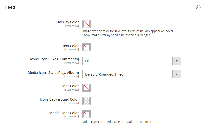
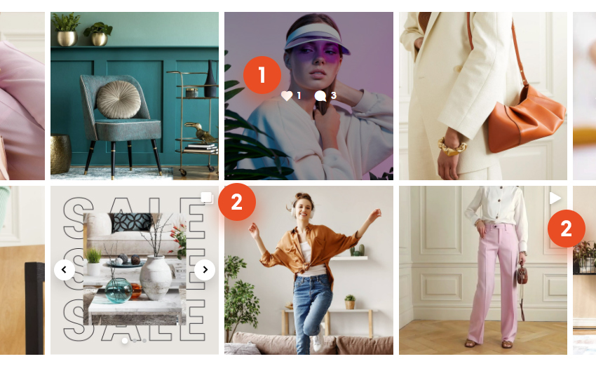
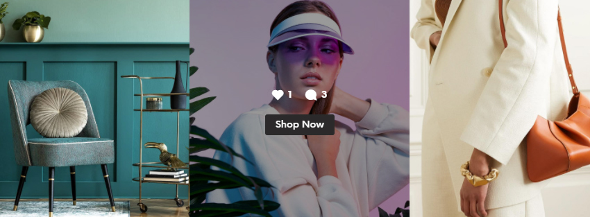
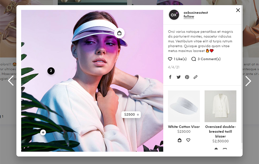
Overlay color – overlay is usually a transparent layer which is shown on image hover to separate content from and image. See (1) om image below. White icons with counters are shown above the image and image has overlay to make it darker.
Icons Style – you can choose from various predefined icons for likes and comments (1).
Media Icons Style and Media Icons Color – these icons are shown in top right corner (2) of item and indicate if post is an image, video or slideshow(album).
Icons Color and Icons Background color– colors of the counter icons: likes, comments (1).
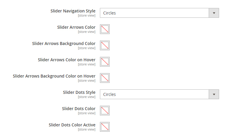
Slider settings are for Instagram widget as carousel slider.
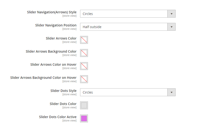
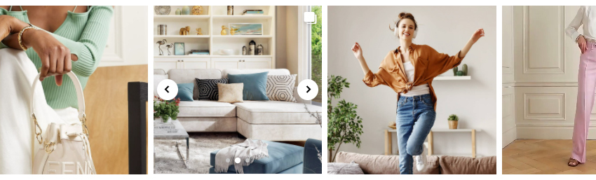
Slider Navigation Style – this is a style of arrows for Instagram widget carousel. It is not for all carousel sliders in Instagram widget but for only when the feed itself is a carousel. You can see examples of a Circles and Sharp arrows styles (1) on image below. You can also disable extension styles for carousel arrows and use theme styles instead if owl carousel is styled in your theme.
Slider Navigation Position – you can show arrows partially outside of the feed as on image below or keep them inside of the feed carousel area.
Slider Dots Style – same as for arrows, you can choose either to use theme styles (if it is styled in theme) or this extension for feed carousel dots (2).
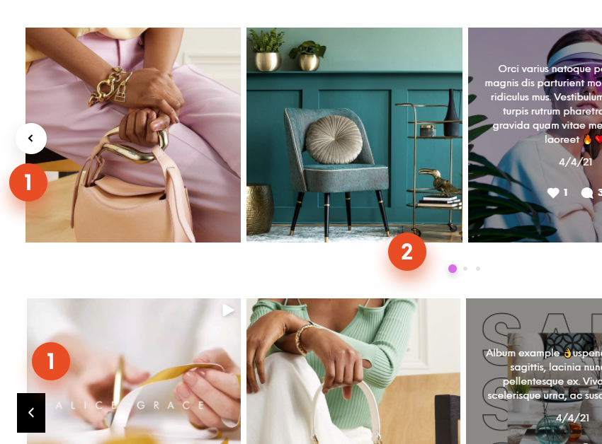
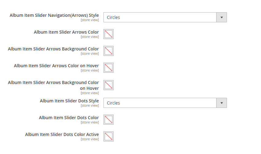
Second item on image below is a carousel slider because it have multiple images and called Album. Same as for the Instagram feed carousel you can change arrow and dots styles and colors for album carousel.
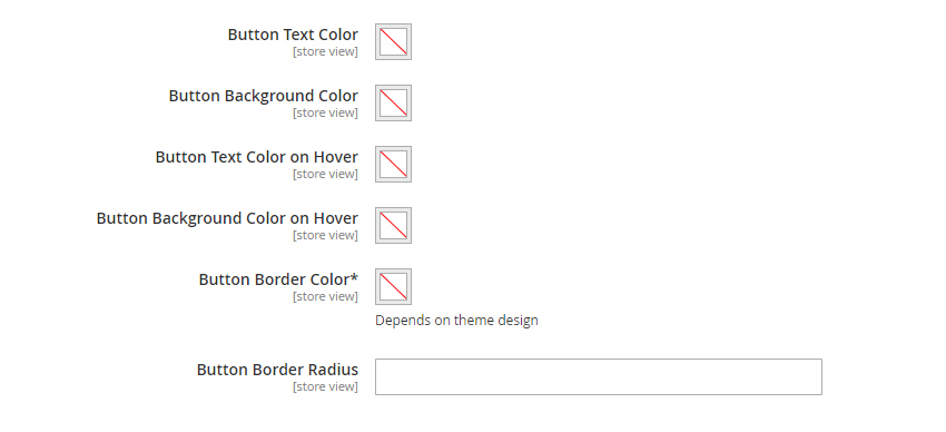
Button is a visual element which can be show on feed item hover above the image or below, depending on the feed layout. By default it will use theme button style and colors but you can also adjust its look using the options below.
Button Border Color – if buttons in you theme have border. Usually for outlined buttons.
Button Border Radius – this is a sharpness/roundness of a button edges. Set 0 for sharp edges.
Hotspots
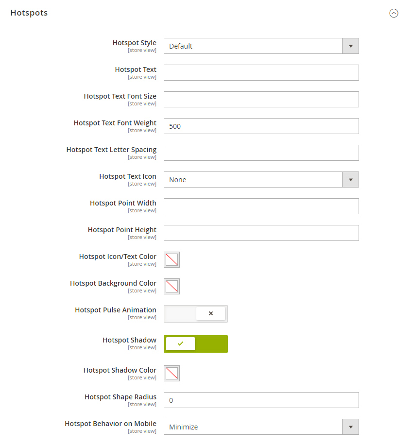
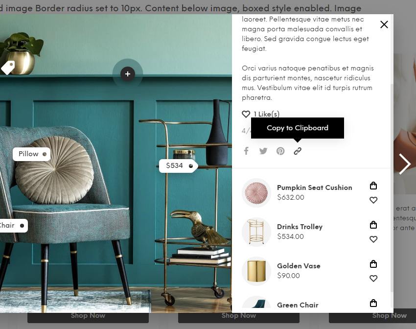
Following settings are global settings for hotspots (1,2) which are shown in Instagram feed modal. Modal appears (if enabled) when you click on item in Instagram feed. Below settings allows to setup default style and colors for hotspots. Most of the same settings can then be adjusted locally, separately for each hotspot in Olegnax > Instagram Pro : Hot Spots
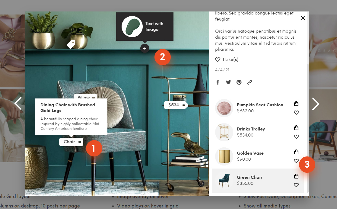
Hotspot Text – this is a text which is shown directly in hotspot point (e.g. “Chair” on image above). Default hotspot don’t have any text and shown as a circle. Note that not all hotspots styles can have text, some of them are icons only.
Hotspot Style – this options allows you to choose a shape of a hotspot. By default it is a circle but you can change to a shopping bag or a price tag shape, and so on. On image above you can see 4 different Hotspot styles.
Hotspot Text Icon – you can choose and icon for a hotspot. For example you see a dark circle(default hotspot style) with plus icon on image above.
Hotspot Point Width and Height – this should be self explanatory. Hotspots have fixed width and height and are not scaled automatically. So if you want to add a long text to a hotspots, you will need to set appropriate width and height for hotspots.
Hotspot Pulse Animation – this will add animated circle to a hotspots. Use it to get more attention to a hotspot.
Hotspot Shadow – this will add shadow to a hotspot shape.
Hotspot Behavior on Mobile – this options is useful if you have big hotspots which takes to much space on a small screens. You can either hide not important hotspots and also minimize them. Minimized hotspots will be shown as a 20px circles with not content or icons inside.
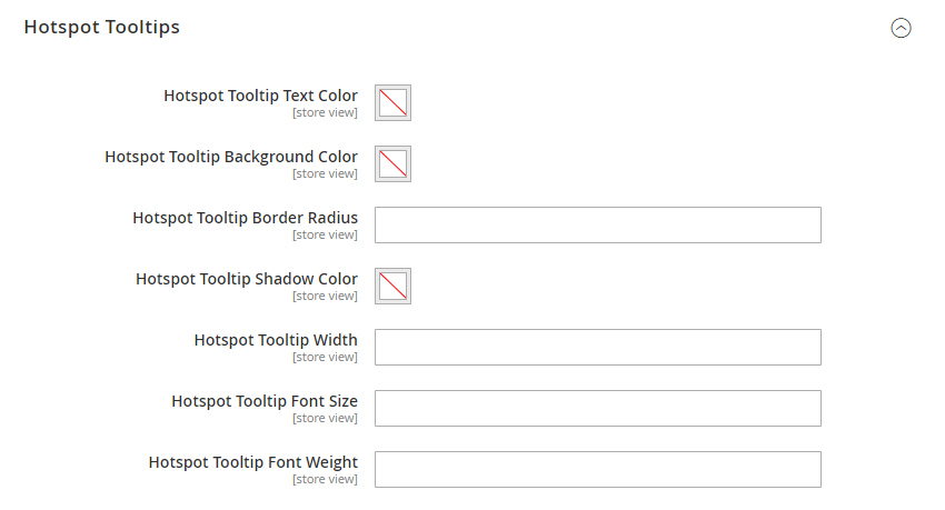
Hotspot Tooltips
Tooltip appear when you hover/tap a hotspot point.
Tooltip Width – same as for hotspot, you can make tooltip wider or narrower depending on amount of content you have in it.
Tooltip Border Radius – this option allows you to change roundness of the tooltip edges. Zero – for square edges.
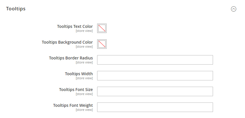
Tooltips
These settings are for tooltips not related to hotspots, e.g. Copy to Clipboard tooltip in modal.
Same as for hotspot tooltips you can adjust its width, edges roundness, colors, etc.
Modal
Modal appears (if enabled) when you click on item in Instagram feed.
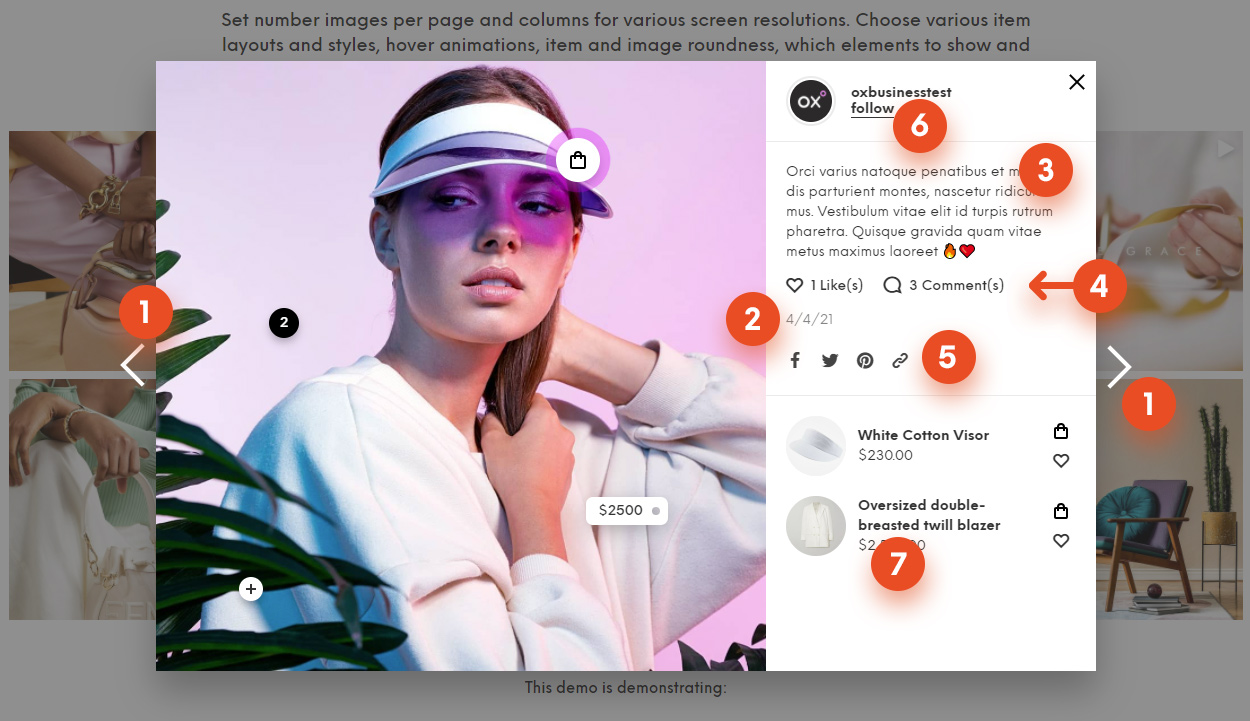
1 – Next/Prev post arrows. 2 – Post date. 3 – Post description. 4 – Likes and Comments count. 5 – Social Share. 6 – Account name with “Follow” link to Instagram. 7 – Linked/related products.
Example of a modal with rounder edges, space around media block and grid layout for related products.
Next/Prev Post Arrows (1) are on the left and right sides of modal.
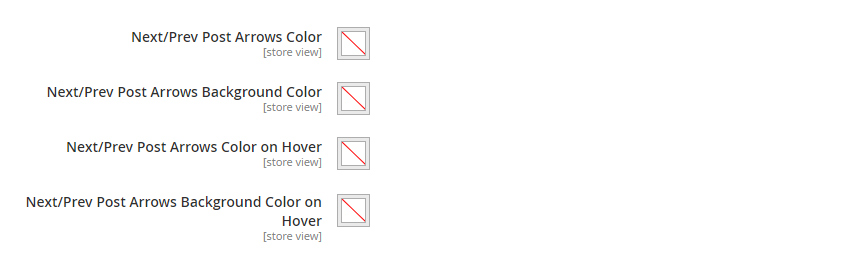
Following settings are for arrows and dots of album items (multiple images per post which are shown in a carousel slider) in modal.
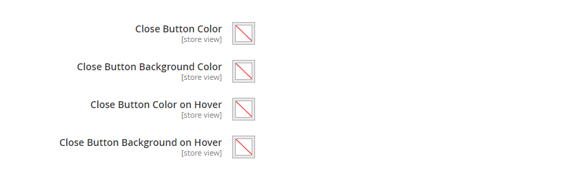
Close button can be found in a top right corner of a modal.
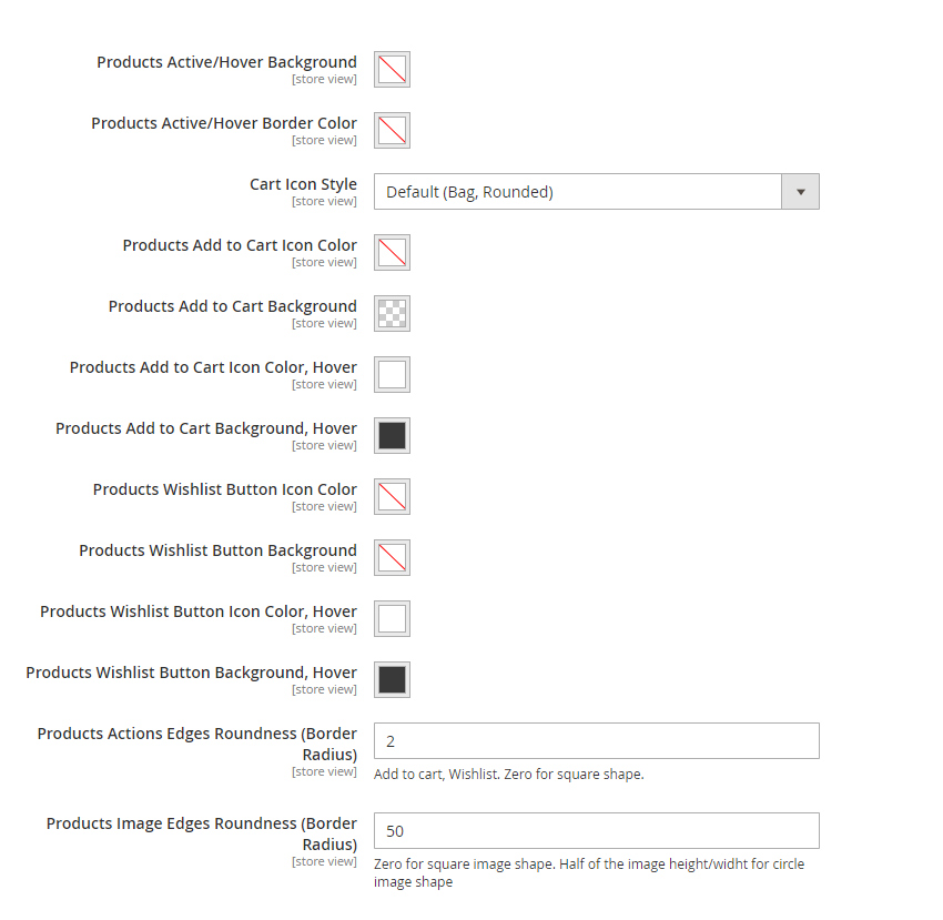
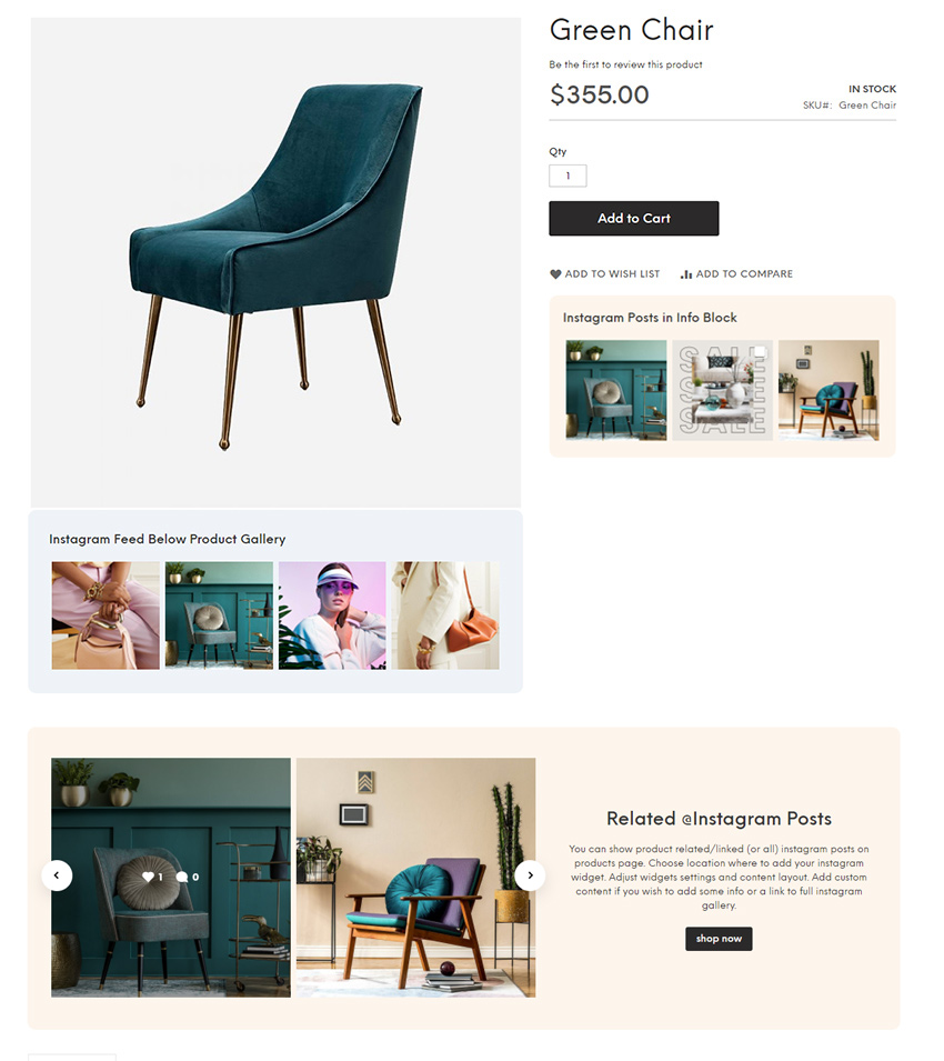
Products settings are for block with related/linked products (7) in modal. Besides the colors, you can choose from various icons style for cart and make images and buttons sharp or rounded or even as circles.
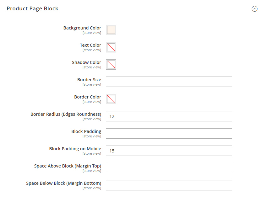
Product Page Block
These are appearance settings for them content block which can be enabled on product page in Olegnax > Instagram Pro : Settings
You can add background to product block content to make it standout a bit, set inner(padding) and outer spaces, adjust content text colors and so on.
Custom Css
If you wish to make some additional changes to the Instagram widget appearance, then you can add your custom css styles in following field.