


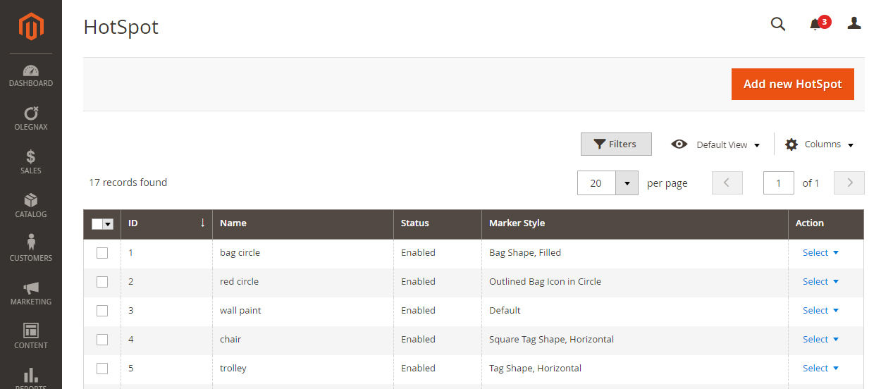
Navigate to Olegnax > Instagram Pro : Hot Spots to open Instagram hotspots list page.
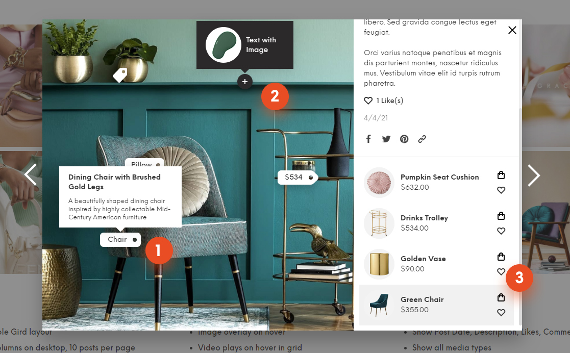
On this page you can create hotspots with custom content and appearance settings. These hotspots then can be added to Instagram posts. Hotspots are shown in modal window which appears when you click on post in Instagram widget (see image below).
Custom hotspots can be used independently to simply show some additional info (e.g. you can see hotspots with image and text in tooltip on image below (2)) or can be added to linked products. By default when you add related product(3) to a post it will show product name in tooltip but you can choose a custom hotspot for it and show detailed info (1).
Create hotspot
Click Add new Hotspot button to create a custom hotspot.
Hotspot Name is for internal use. It is used when you add it to your posts/related products. So name it the way you like.
Hotspot Point Text – this is a text which is shown directly in hotspot point. Default hotspot don’t have any text and shown as a circle. Note that not all hotspots styles can have text, some of them are icons only.
Hotspot Point Style – this options allows you to choose a shape of a hotspot. By default it is a circle but you can change to a shopping bag or a price tag shape, and so on. On image above you can see 4 different Hotspot styles.
Hotspot Icon – you can choose and icon for a hotspot. For example you see a dark circle(default hotspot style) with plus icon on image above.
Hotspot Width and Height – this should be self explanatory. Hotspots have fixed width and height and are not scaled automatically. So if you want to add a long text to a hotspots, you will need to set appropriate width and height for hotspots.
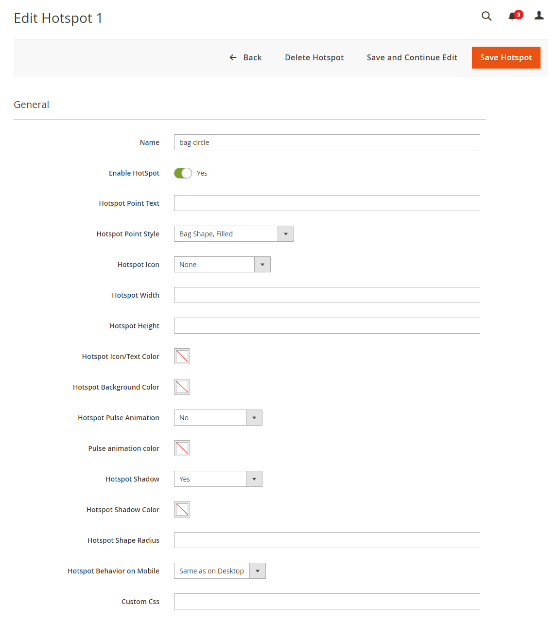
Hotspot Pulse Animation – this will add animated circle to a hotspots. Use it to get more attention to a hotspot.
Hotspot Shadow – this will add shadow to a hotspot shape.
Hotspot Behavior on Mobile – this options is useful if you have big hotspots which takes to much space on a small screens. You can either hide not important hotspots and also minimize them. Minimized hotspots will be shown as a 20px circles with not content or icons inside.
Custom Css – you can add custom css class to each hotspots in case you want to make some extra edits.
Hotspot Tooltip
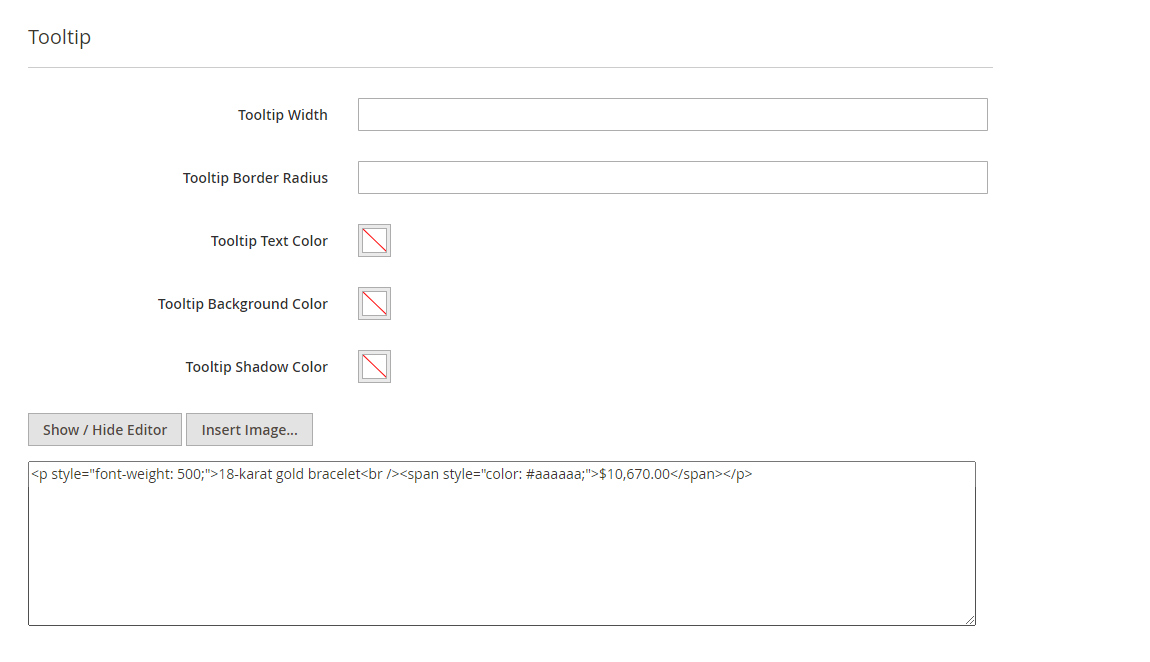
Tooltip appear when you hover/tap a hotspot point. You can add custom content in it including images and html tags. These content is passed to JS so don’t try to add script tags or widgets there.
Tooltip Width – same as for hotspot, you can make tooltip wider or narrower depending on how many content you have in it.
Tooltip Border Radius – this option allows you to change roundness of the tooltip edges. Zero – for square edges.
Additionally you can adjust tooltip background, shadow and text colors. Note that theme styles may override text color settings for some elements (e.g. headings). In this case you can override styles either by adding custom class to hotspot or by adding inline styles to elements in hotspot content. E.g.: style="color:#aaaaaa" added to a span tag, as shown on image below, will change text color inside of a span.
Global and Local Settings
The same appearance settings can be set globally for all hotspots and hotspot tooltips. So if you don’t want this particular hotspot to have different settings, then you can simply set options in Olegnax > Instagram Pro : Appearance.