


Add mobile Menu
To add a mobile menu you need to menu to “Mobile Menu” location.
1. Open Appearance / Menus
2. Choose/switch to menu that you want to show on mobile.
3. Scroll down to the “Menu Settings” block at the bottom of the page and assign the menu to one of the “Mobile Menu” locations in the “Display Location” box.
Once everything is done, be sure to click the “Save Menu” button.
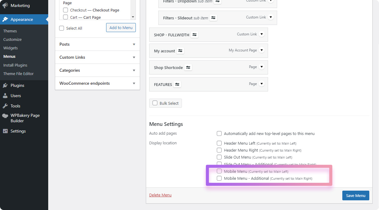
There are two “Mobile Menu” locations so you can add two menus. This can be usefull if you have two menus in header and want to show the same menu on mobile. For example you have Header Left menu and Header Right menu, simply assign first (Header Left) menu to Mobile Menu location and Header Right menu to “Mobile Menu – Additional” location.
How to add different menu for mobile
It is a good idea to have a less complicated menu for mobile. Lets say you created menu with a lot of custom content for desktop using mega menu builder but it looks too bloated on mobile.
Don’t worry, you can create as many menus as you want! So you can create a new menu specifically for mobile and/or slideout (off-canvas) panel. After you created a new menu, simply assign it either to “Mobile Menu” location in the “Display Location” box.