


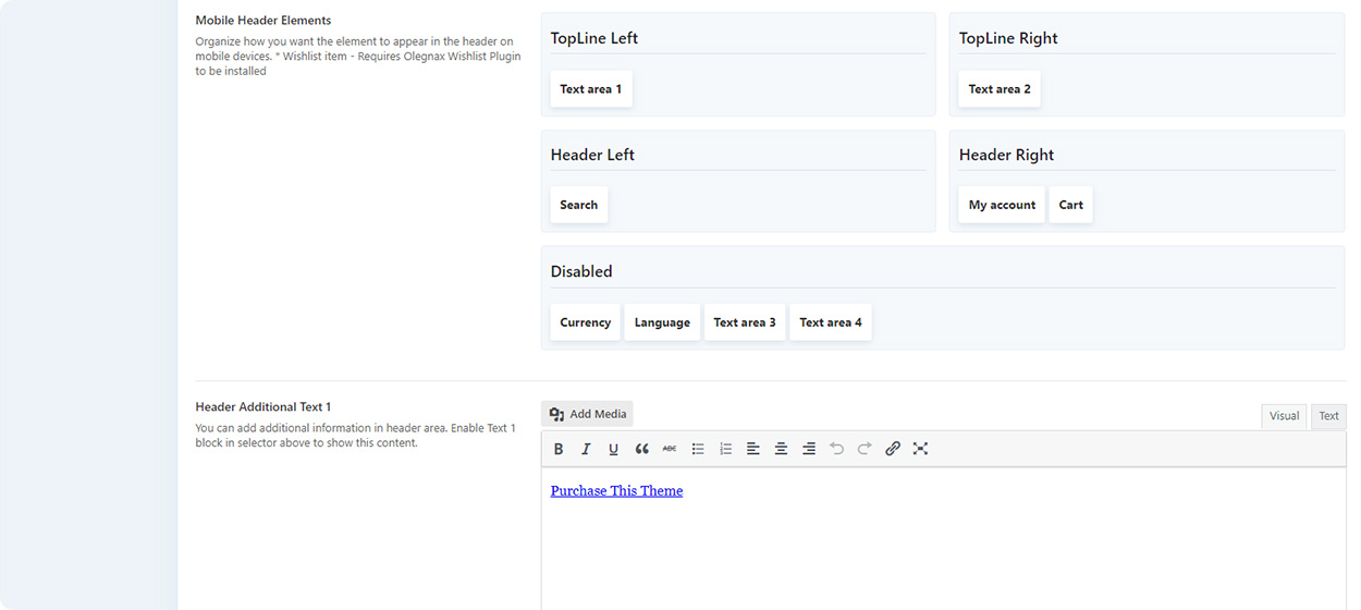
Same as for desktop header there is a header builder for mobile. You can find it in Retro / Header / Mobile Header.
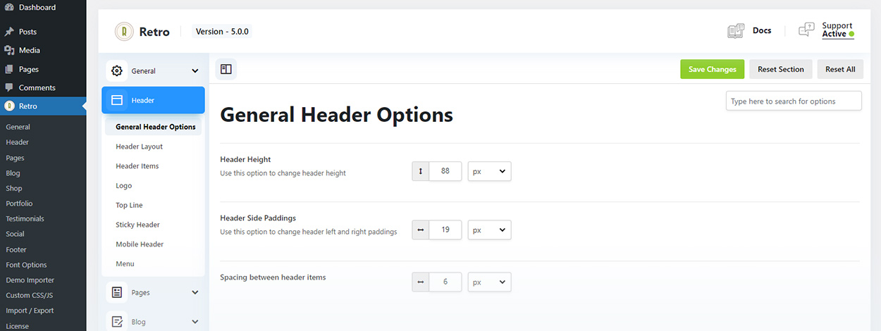
First of all you need to decide when desktop header will be replaced with a mobile version. You can do this using “Mobile Header Visibility” options. After that you can see how much space you have in your mobile header so you can decide how to organize items in both header and mobile header.
The next thing you need to do is to choose a layout for your mobile header.
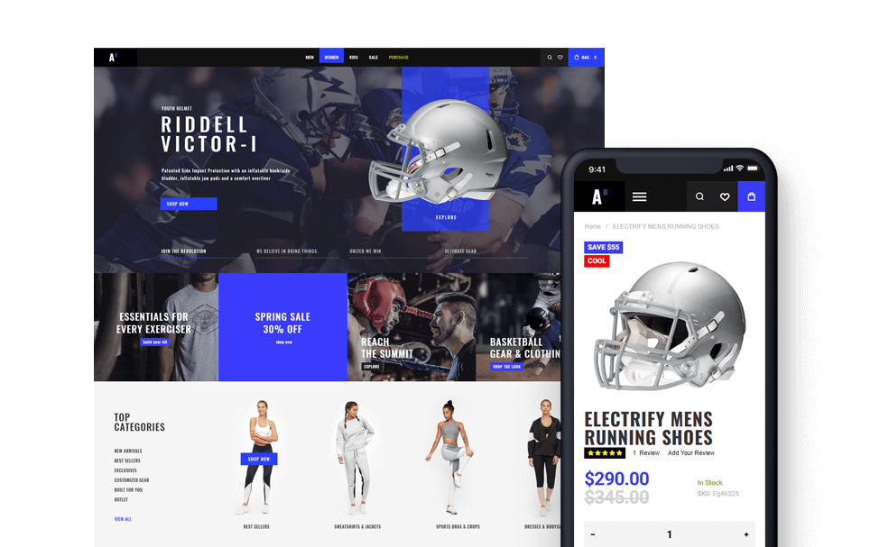
There is not much space on mobile so organize your header items wisely. If you want to show a lot of elements in header then it is a good idea to choose from 2 line layouts, when menu or elements are below the logo. If you want to show up to 2 items on each side or 4 items in total for not centered headers, then you can use a one line layouts, as on example below.
After that you need to drag and drop elements to different header areas depending on selected layout.
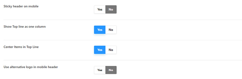
Same as on desktop, you can make header sticky on mobile by enabling “Sticky header on mobile” option.
Show Top Line as one column – if disabled top line will be divided to two columns same as on desktop. If enabled second topline area will be disabled and the first one will be 100% of tiop line width.
Since mobile header is smaller than on desktop, you may want to use a smaller (alternative) version of the logo here. You can add alternavite logo image in Retro / Header / Logo
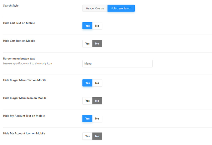
Additionally you can choose how exactly to show header items on mobile, as icons only, with text or a text only.
Theme also comes with a mobile menu slideout, where you can add a custom content above and below the menu items using “Menu Additional Content Top” and “Menu Additional Content Bottom” textareas.
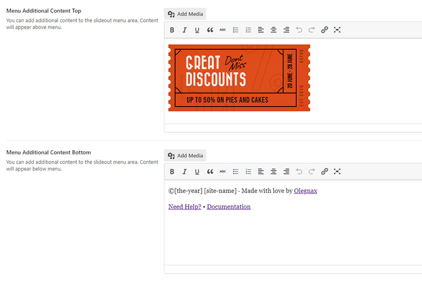
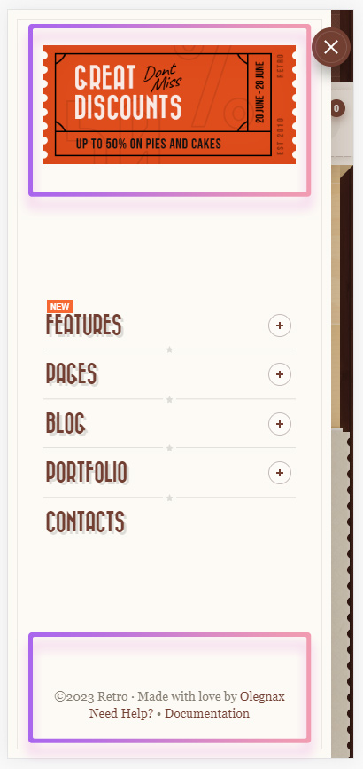
Position of a custom content areas in mobile menu slideout.