


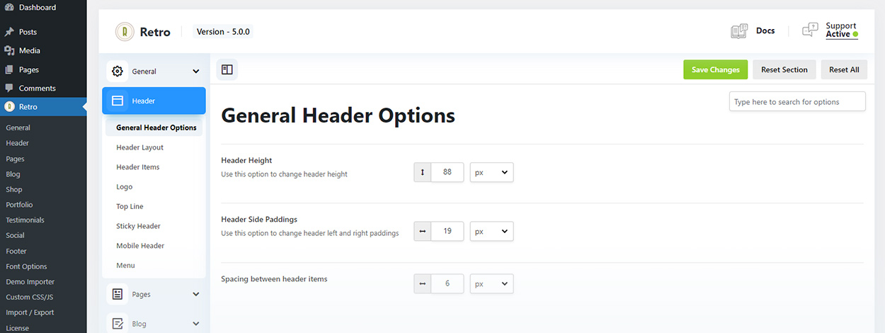
You can find header settings in Header section of the Retro settings: Retro / Header
Header section divided to multiple subsections.
Under General Header options you can adjust some of the header spacings and height. In most cases you will want to adjust this settings after you defined the layouts and items in the header which you can do in the next header subsections.
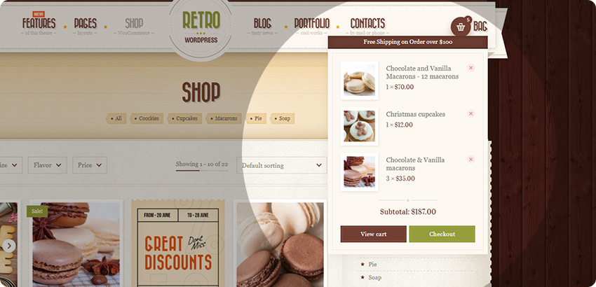
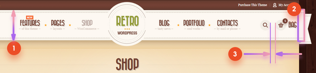
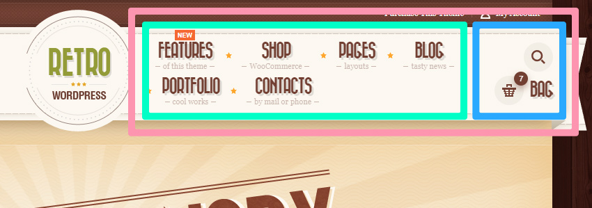
Header height – basically a height of a white ribbon. See 1 on image below.
Header Side Paddings – distance from the egde of the ribbon to the header content/items. See 2 on image below.
Spacing between header items – See 3 on image below. This is a pace between the header items added in page builder, such as search, bag, my account, slideout navigation button.
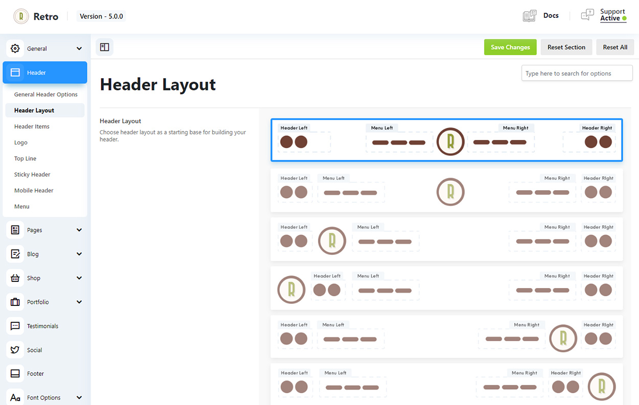
Header Layouts
The first thing you probably want to do when starting customizing your header is to define header layout.
You can do this in Header Layouts settings page ( Retro/Header/ Header Layout ). Header layouts define where the logo, menu and areas for items will be located.
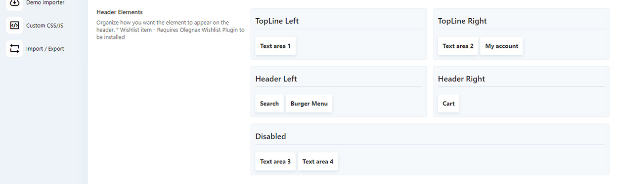
After that you can drag and drop various items such as Cart, Burder Menu, Search, My Account, etc. to different header areas.
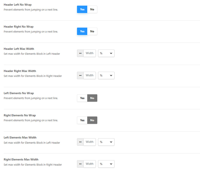
Now lets say you’ve added a lot of items in header and menu is squeezed, header elements are going outside of the header and so on. Header looks broken. This is when below settings will come in handy.
No wrap options allows to choose either elements will always be in one line or they will jump the next line wherer there is not enoght space for them.
When max width allow to set a maximum width that block will occupy in header.
Lets say you have a situation as below and you want to make sure that bag and search icons are stay in the same line and not one below another. You can enable Right Elements No Wrap options for this. We do this for right elements because it is right side of the header.
This is what we get after we enabled no wrap for header elements. As you can see they stay in one line:
Alternatively you can set a width for elements and lets say limit their width to 50% of the right header area. In this case element will jump on the next line if they filled half of the right header area width.
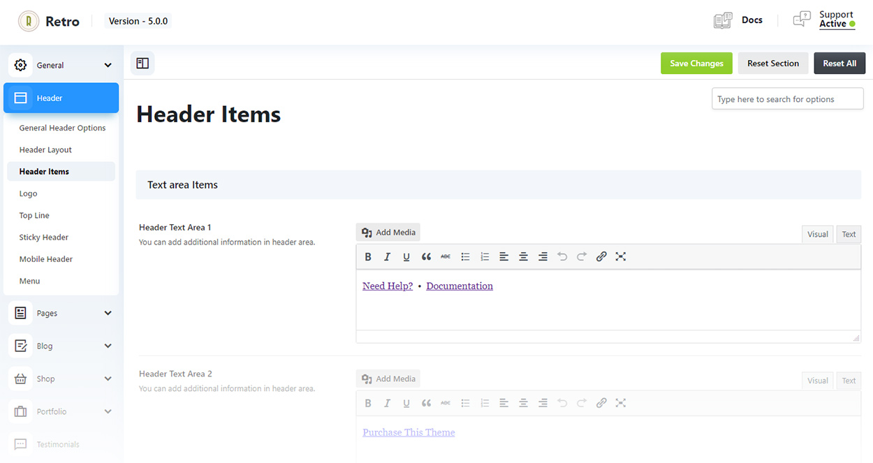
Header Items Settings
You can adjust settings for each items you placed in header in Retro / Header / Header Items.
Here you can add content for text areas that you added in header. You can add any content including shortcodes.
Settigns are grouped for each header item. You can set icon sizes for each menu item, set text near icon, as well as define what to show on desktop: only icon, text or both.
Burger Menu Item Settings
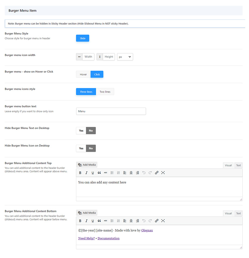
Slideout Custom Content
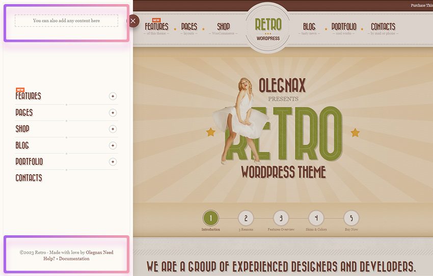
Burger Menu Additional Content Top / Bottom – this is where you can add a content which will be displayed above and below the menu in a slideout modal.
On image below content areas in a slideout are highlighted.
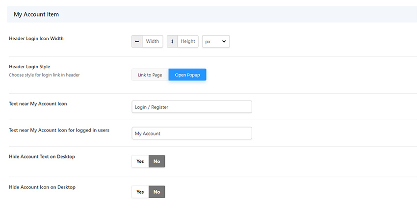
My Accout Item
Same as other menu items, my account has settigns to adjust icon size and text.
You may want to change it if you added item in a top line area, which is smaller than the header content.
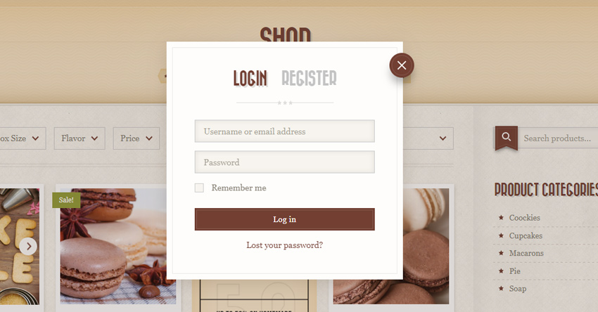
Login Popup
You can choose action for my account item: redirect to my account page or open a login popup.
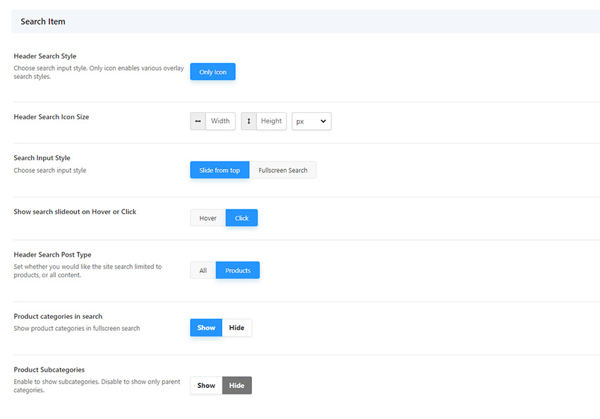
Search Item
You can choose between a slideout from top and a full screen search modal styles. You can see examples on images below.
You can also choose what to search for: everything or products only.
Additionally you can show product categories in a search modal which work as checkboxes and simply looks cool. If enabled, your customer will be able to choose in which category to search for a product.
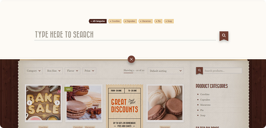
Search “Slide from top” example:
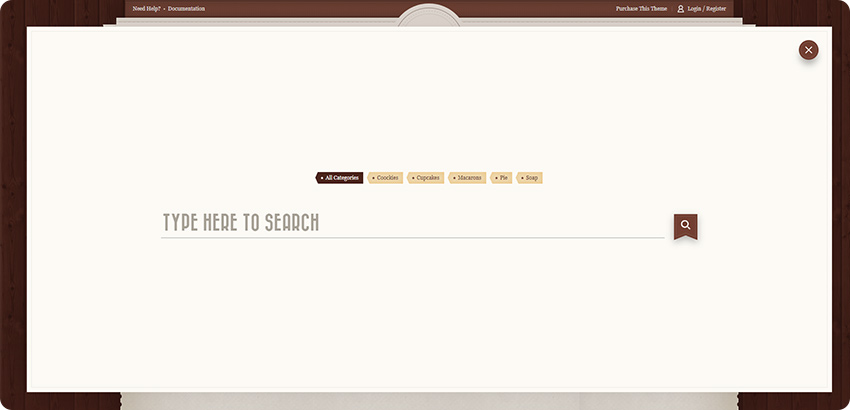
“Fullscreen Search” example”
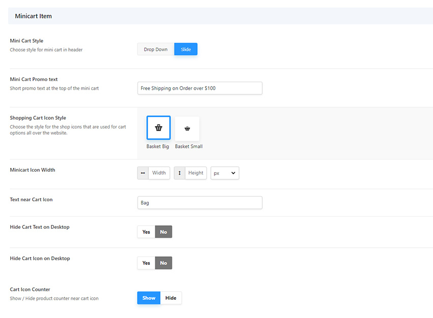
Minicart Item
Shopping Cart Icon style – Currently there are two different basket icons available. Smaller version is from the Retro version 4 and is better when minicart item is place in top line.
Mini Cart Style option allows you to choose betweel a drop down or a slideout minicart.
See examples below.
Mini Cart Promo text – Aslo you can add a promo text at the top of the minicart modal. Brown line at the top of the minicart on images below.
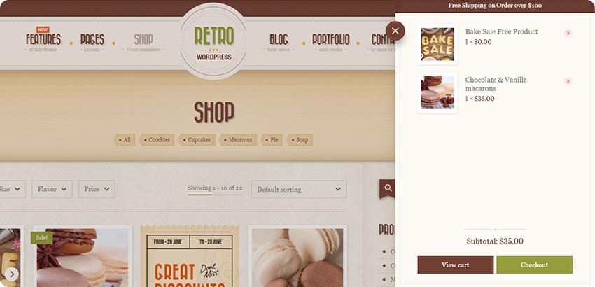
Example of a “Slide” minicart style:
Example of a “Drop Down” minicart style: