


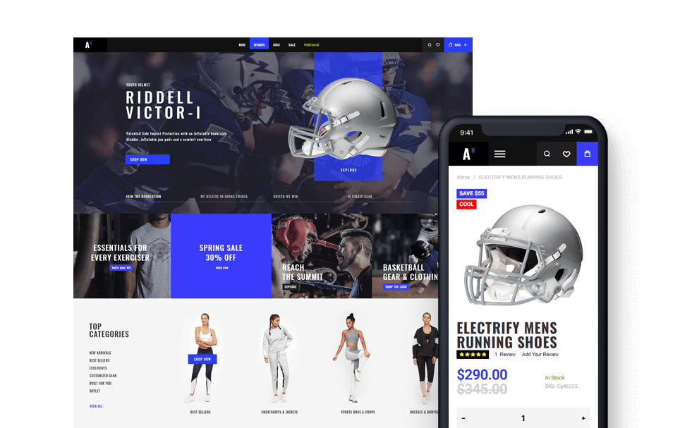
Create a Navigation Menu in WordPress
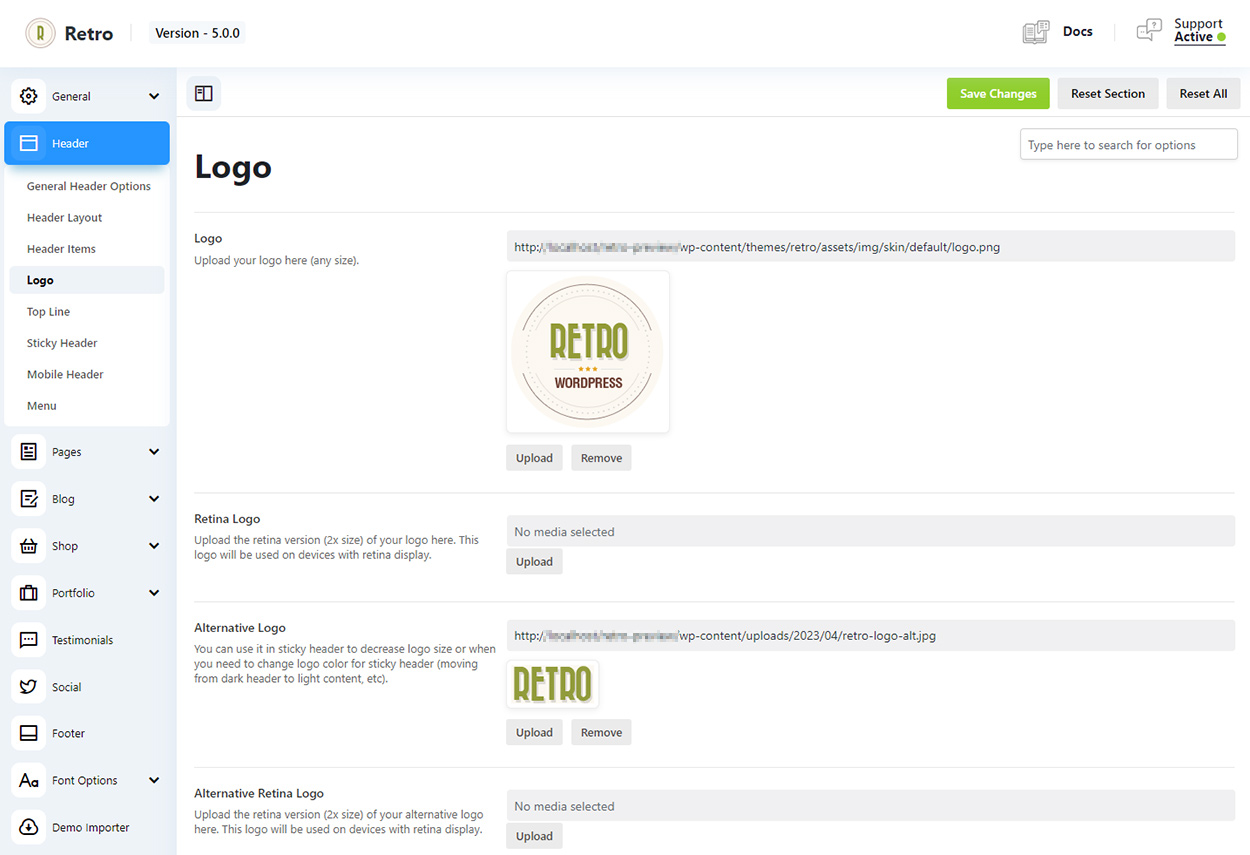
To setup logo go to Retro / Header / Logo
Theme comes with 2 logo versions and each has a retina version:
First logo is a default logo. This is what will be displayed everywhere if other logo images are not added.
Retina logo – you need to add a 2x bigger version of your logo fo retina screens. You can skip it and default logo image will be used as a fallback but if your default logo image is small then on retina screen it may look not very good.
Alternative Logo – you can choose alternative logo for mobile or sticky header (in mobile and sticky header settings page).
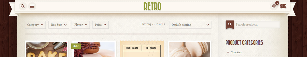
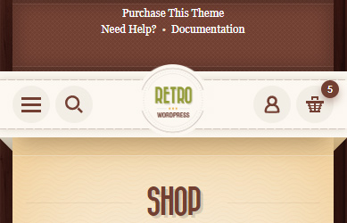
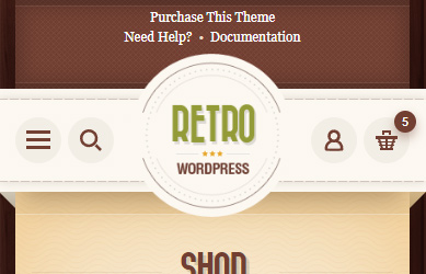
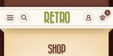
You can see how it works on our demo. When you scroll down a header became smaller with a smaller version of the logo. This is because we set and alternative logo for header. See image below for example.
Theme comes with separate logo settings for desktop, mobile and sticky header.
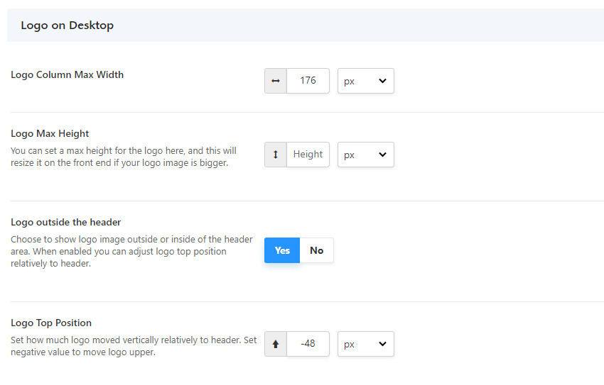
Logo on Desktop
Logo Columns Max Width/Height – by default logo will occupy 25% the header in header layouts with centered logo. But you can set it value same as your logo image width to free some extra space for other content in header. Or vice versa if your logo is not a circle an you need some more space for a logo.
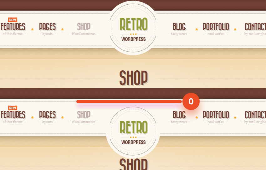
Logo outside of the header – this option allows you to move logo outside of the header content which is a ribbon in our theme. You can see on images below that logo is image is not limited by the header height.
Logo top position – on image below you can see two examples: 1. a logo with -48px for top position and 2. a logo with 0px top position. Zero is an inner top of the header content (0). So if you want to move logo up you need to add a negative value.
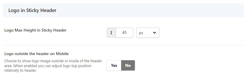
Logo in Stiky Header
You can also adjust logo position outside of the header for sticky header and set logo max-width to reduce its size in sticky header. This can be useful is resize is enabled for sticky header and it is smaller than the original header.
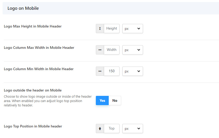
Logo on Mobile
As I already said above, by default logo will occupy 25% of the header in header layouts with centered logo. On mobile this will look as on the first image below. So if you have only a few items in header and some extra space, then you can make your logo bigger by setting Logo Column Max / Min Width values.
Since logo size is not fixed by default and you can also change it using option, you may also need to adjust a top position of the logo if “Logo outside the header on Mobile” is enabled.
On the other hand, you may want to disable “Logo outside the header on Mobile” option in case you decide to use a smaller (alternative) logo image on mobile which should stay within the header content. As on example below.