


How to Convert Simple Menu Drop Down to Mega Menu
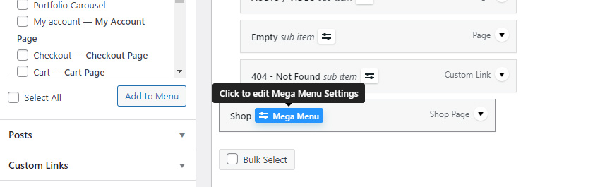
To begin customizing the content of your menu dropdown, click on the “Mega Menu” button located next to the menu item name. Note that it is minimized to an icon only  when mouse is not over the menu item.
This will open a modal where you can customize your menu item as well as a drop down.
I don’t see “Mega Menu” button! What to do? You need to save menu after you added a new item for “Mega Menu” button to appear for this menu item.
This will open a modal window for the mega menu. Next, click on the “Layout” tab on the left side of the modal.
Here you can find a “Drop Down Content Mode” option which allows you to choose the way you will customize your content.
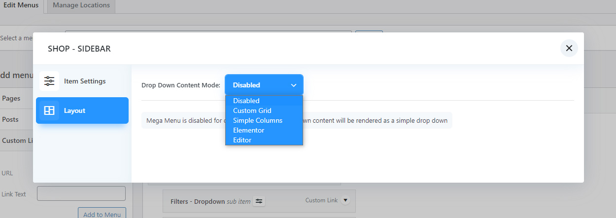
Drop Down Content Modes
We have introduced several options for enhancing your menu’s dropdown content, offering a range of choices from easily editable but somewhat restricted customization to more complex yet highly customizable approaches. Let’s delve into each of these options in greater depth, enabling you to select the most suitable method for your specific requirements.
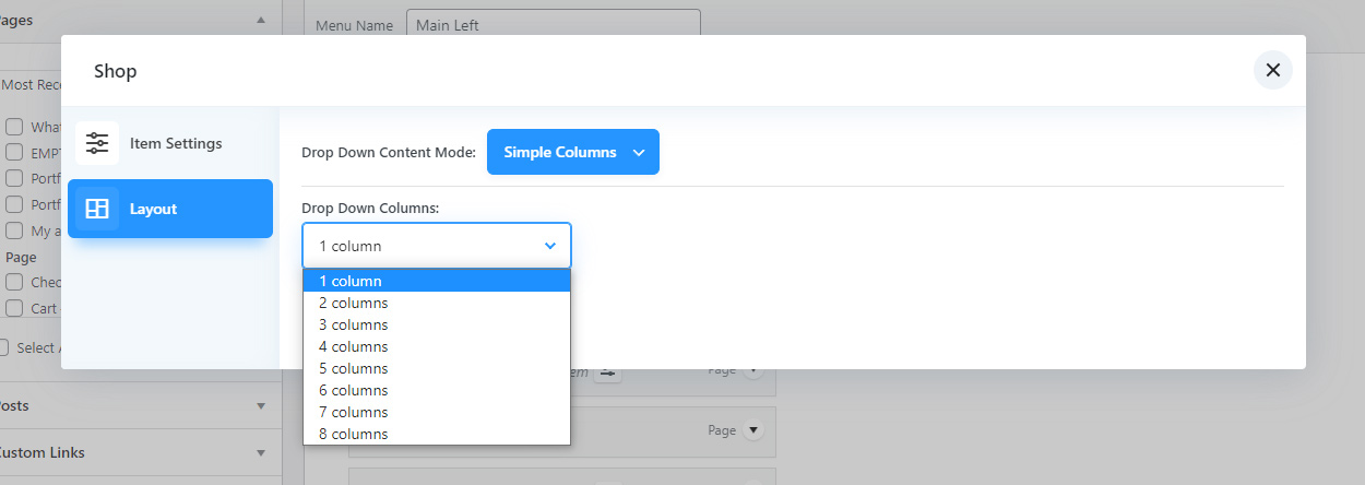
Mega Menu Drop Down Content “Simple Columns”
The “Simple columns” mode enables you to effortlessly display your drop-down items in multiple columns without the requirement to manually rearrange them. You simply need to select the desired number of columns. This mode is particularly beneficial when dealing with a substantial number of items, resulting in an extensive drop-down list. By dividing the items into columns, the drop-down becomes more user-friendly and easier to navigate, enhancing its usability.
Mega Menu Drop Down Content “Custom Grid”
Custom grid mode offers extensive control over your menu items, granting you various options to customize the layout. Within this mode, you have the ability to create new columns (1) and rows (2), adjust the column size (3) for each individual column, rearrange menu items within the columns, and even incorporate custom content using widgets (4).
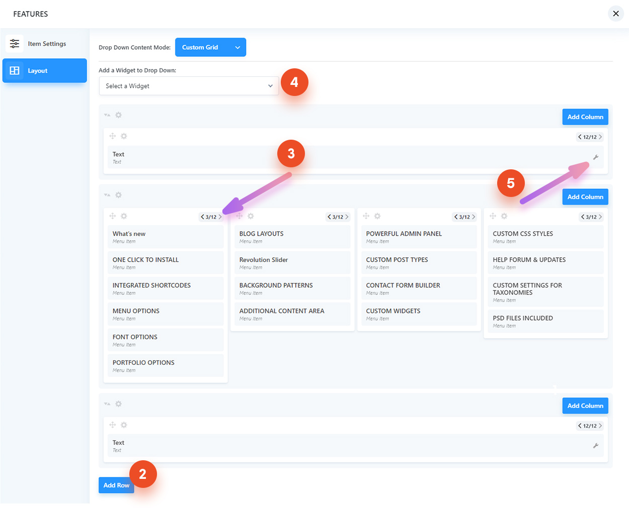
How to rearrange items:
To rearrange menu items, columns, and rows, you can utilize the “drag and drop” feature. Simply click on a menu item, column, or row, and while holding down the left mouse button (or using your finger on a touch device), drag the item to the desired location. For columns and rows, click and hold the top part of the column/row box.
How to change column width:
To adjust the width of a column, click on the small arrows located in the top right corner of the column box (3). These arrows allow you to modify the column width. The system employs a 12-column grid. If you are unfamiliar with this concept, it means that 12 represents 100% width. For instance, a width of 3/12 corresponds to 25% (or 1/4) of the content width.
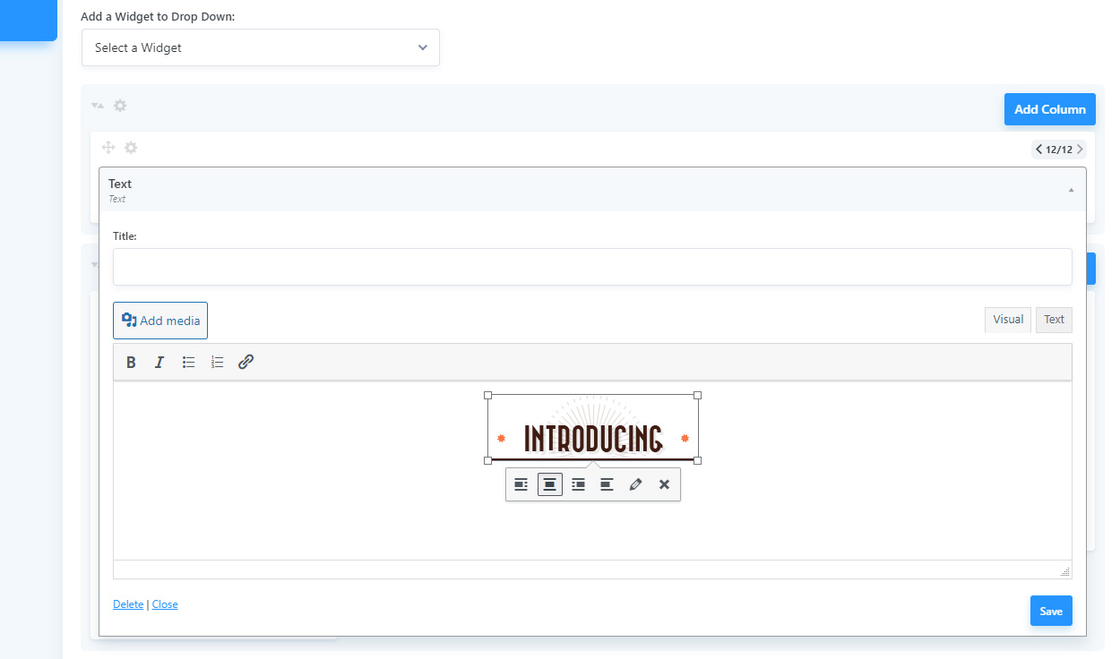
How to add custom content:
You can incorporate widgets into the menu by selecting them from the “Add a Widget to Drop Down” dropdown (4) located at the top of the modal window. To add a textarea for custom content, choose the “Text” widget. Within the textarea, you can include any desired content, including shortcodes.
After selecting a widget from the “Add a Widget to Drop Down” dropdown (4), it will be initially added to the first column so move it to the desired location. You can then click on the “wrench” icon located in the top right corner of the widget to expand its settings and edit its content.
Please note that widgets and menu items can only be placed within columns. Therefore, if you create a new row, you must also add at least one column to that row.
Advanced – Custom Class
You can add custom css classes to rows and columns by clicking on cogwheel icon in the top left corner of the column/row boxes.