


This is documentation for quickview hotspot extension bundled in Athlete 2 Theme. For premium version visit this page: Quickview Hotspots Extension For Magento 2
Installation Information
Module Name: Olegnax_HotSpotQuickview
Module Path: app/code/Olegnax/HotSpotQuickview
Check this article to learn how to install Magento 2 extensions.
iThis extension require Olegnax Core and Olegnax_Quickview modules to be installed. Core module can be installed both Manually and via Composer.
iPlease note that Olegnax HotSpotQuickview, Quickview and Core modules are already packed with Athlete2 – Strong Magento 2 Theme, so you don’t need to install it if you use our theme.
Overview
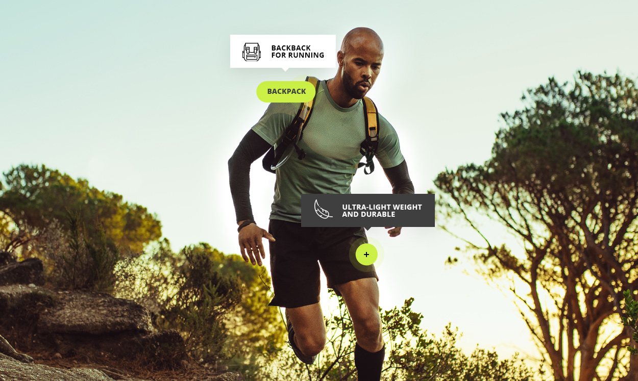
This extension allows to add hotspots to images using widget. When clicked on hotspot it opens liked product in quickview modal. It only works with Olegnax Quickview extension and requires it to be installed.
You can add tooltips on hover with html content. Adjust hotspot and tooltip colors and size, add text to hotspot or show only icon. Minimize hotspots on mobile and more.
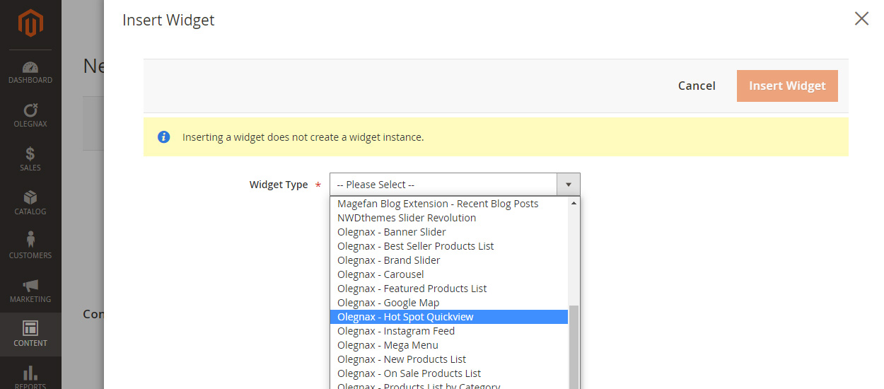
How to add Hotspot Widget
To add hotspot widget simply click in Insert Widget button when you edit page or any other content that allows to add widgets (e.g. Carousel Slider).
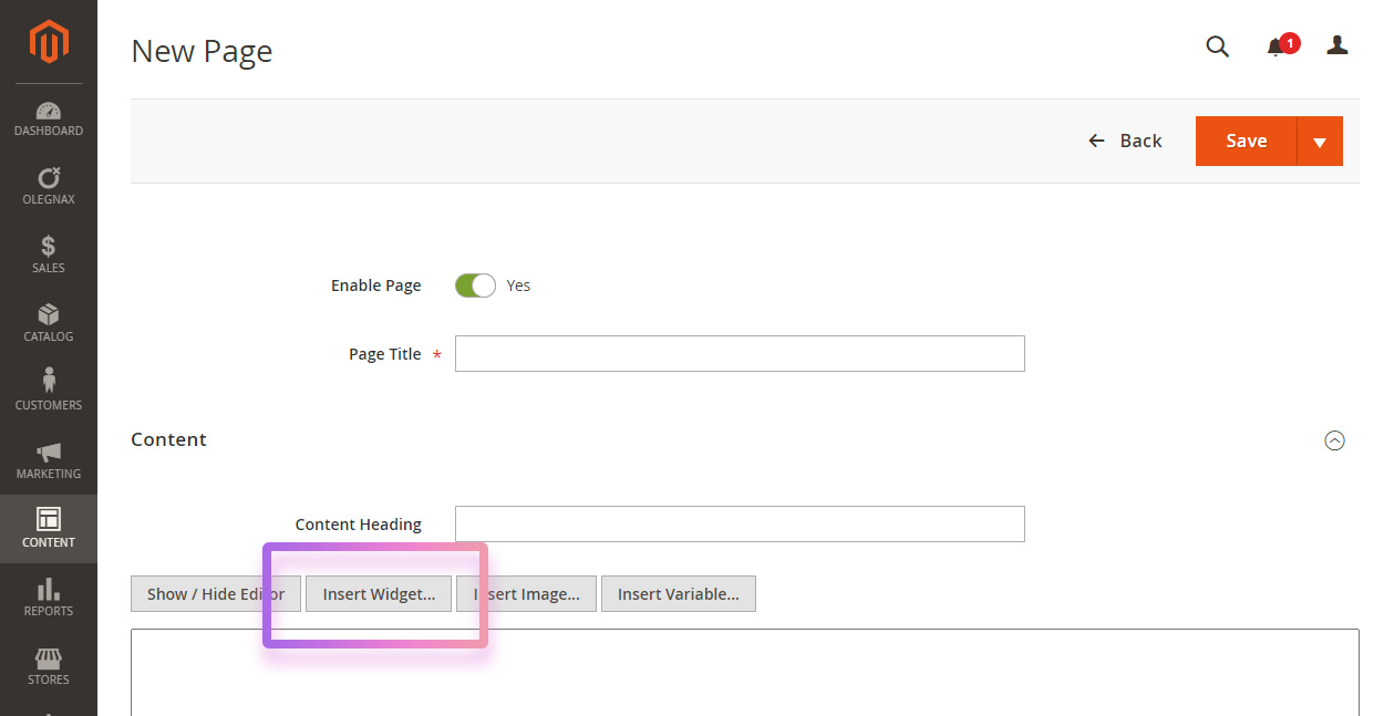
Choose Olegnax – Hot Spot Quickview and adjust widget settings.
Hotspot Widget Settings
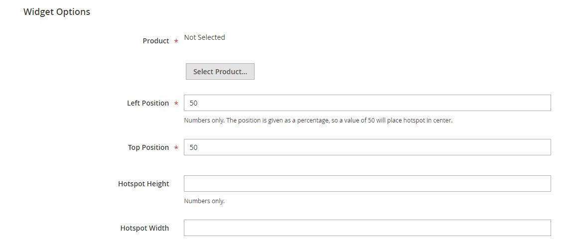
Product – click on Select Product button and choose what product will be opened in quickview on click on hotspot.
Left and Right Position – this is the position relatively to the parent element (wrapper). Position set in % in order to be responsive. By default it is set to the center (50%,50%) of the wrapper.
Hotspot Height and Width – hotspot have fixed height and width. by default it is 38px. You need to adjust it if you want to add text in it.
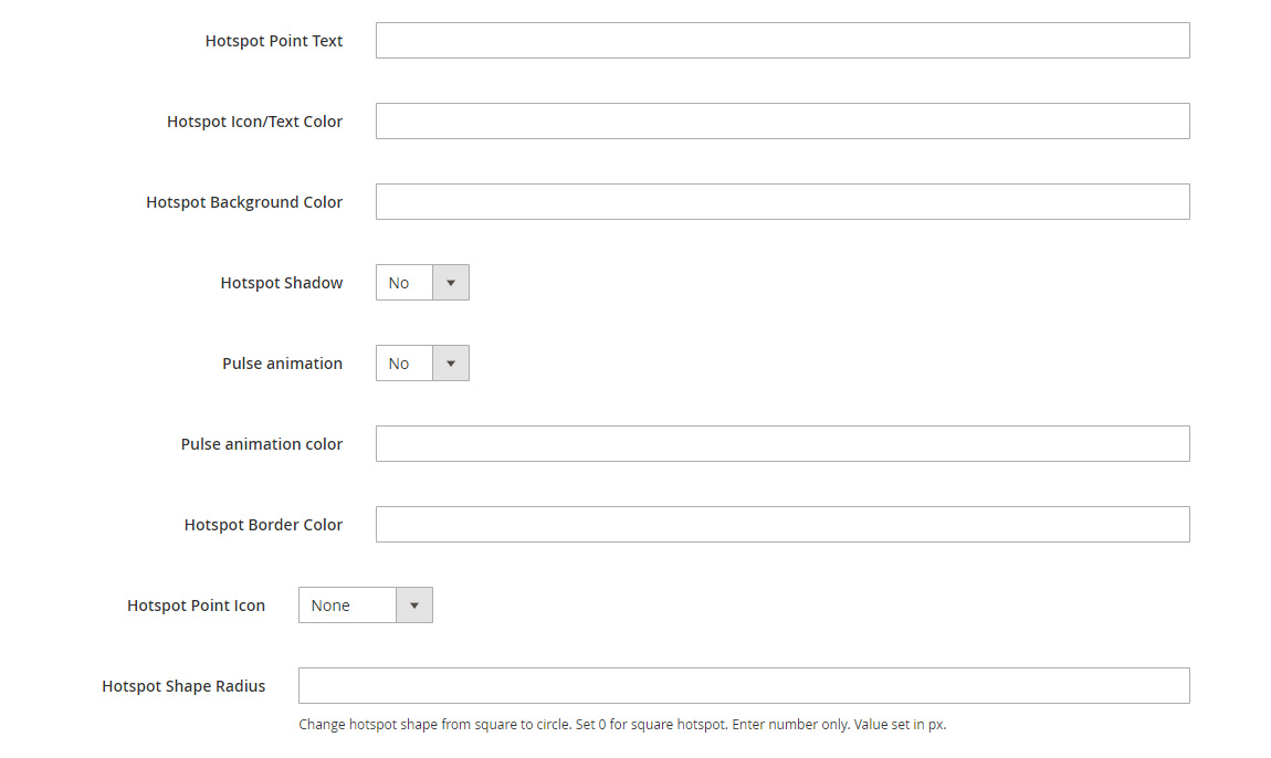
Hotspot Point Text – this option allows to add text inside of the hotspot.
Pulse Animation – adds pulsating circle behind the hotspot.
Hotspot Point Icon – currently allows to add plus icon in two different sizes to hotspot.
Hotspot Shape Radius – you can change hotspot shape from square to circle. Set 0 for square hotspot. Set half of the hotspot width for fully rounded sides. E.g. to make circle hotspot set width and height to 38px and shape radius to 38/2 = 19px.
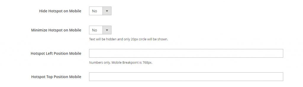
Hide Hotspot on Mobile – you can hide hotspot on mobile if it doesn’t play well with other content on small screen.
Minimize Hotspot on Mobile if its too big for mobile or you have multiple hotspots overlapping. This option will make hotspots as small dots with no text or icons inside.
Below example of minimized hotspots on mobile and some not.
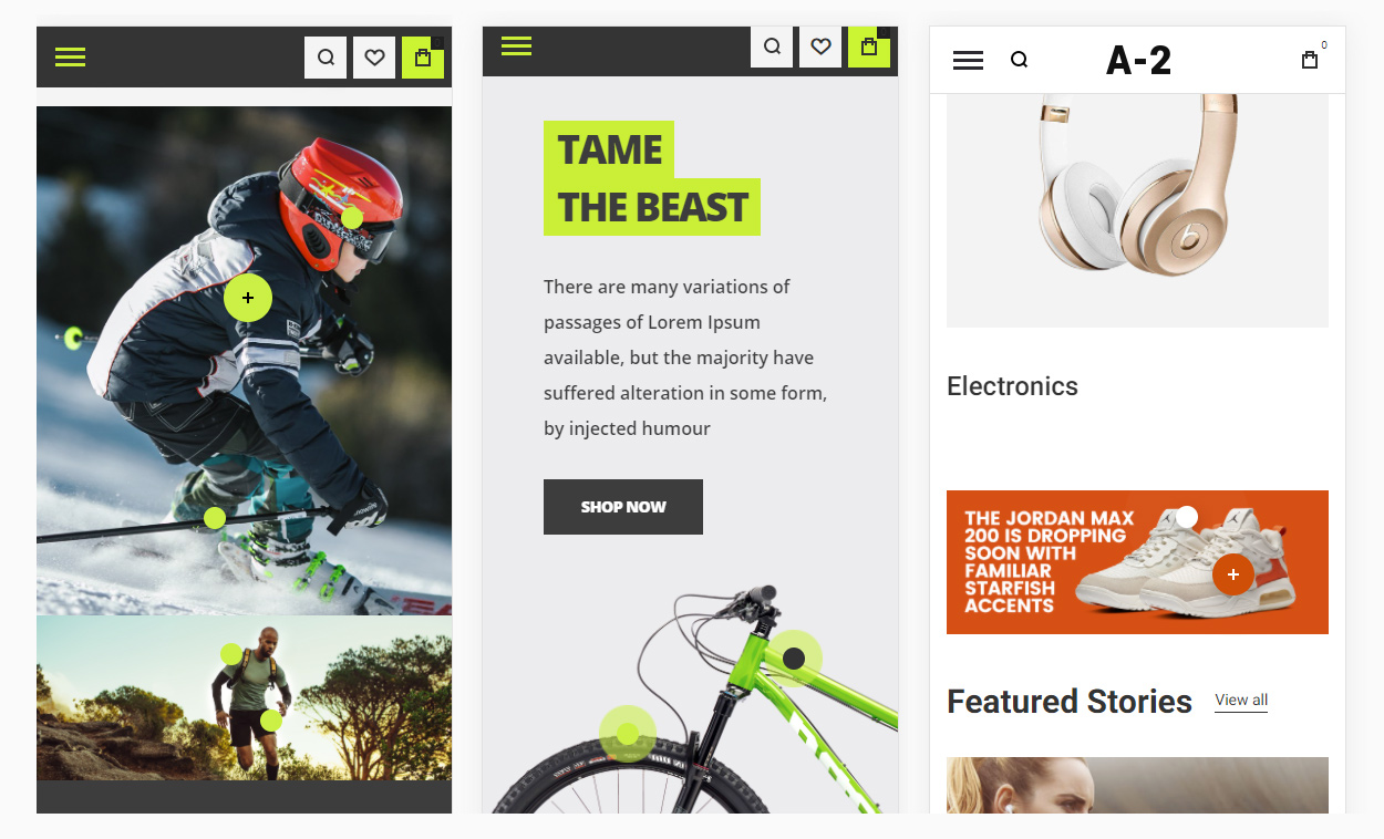
Hotspot Left / Top Position Mobile – you can use different image for mobile and set different hotspot position for small viewport size. Or simply adjust hotspots position if they became too close to each other on mobile.
Hotspot Tooltip
When you click on tooltip it opens Quickview modal but you can also add text or any html content which will be shown on hover.
You can either add simple text or set static block as source of tooltip content, where you can add images and html tags.
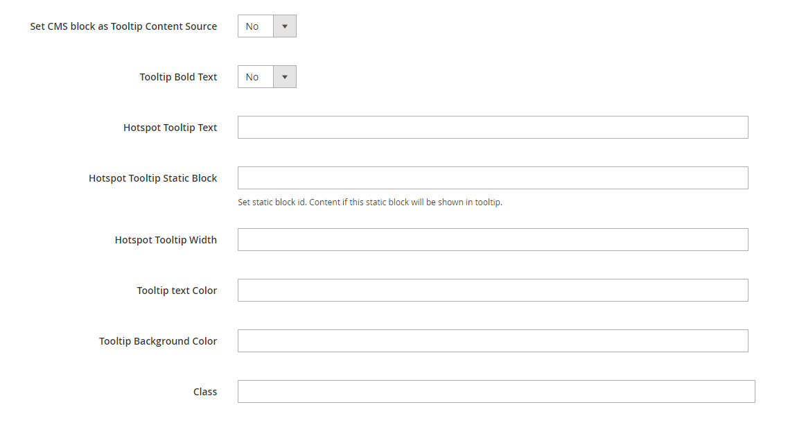
Set CMS block as Tooltip Content Source – this option allows you to show html content in hotspot tooltip via cms blocks (Content / Blocks). After it is enabled set cms block id in Hotspot Tooltip Static Block field.
Hotspot Tooltip text – use this option if you only want to show simple text in hotspot tooltip. Note that some symbols should be converted to ascii code in this field. E.g.: dollar sign $ should be $ so $56 will be $px;56
Tooltip Bold Text – this option will set font weight 700 to tooltip text.
And of course, you can adjust tooltip width and colors.
Class – allows to add custom class to tooltip. Use it if you wish to add some more changes to hotspot or simply style it via CSS so you don’t need to configure these settings for each hotspot.
Hotspot on Images
You can add Hotspot widget anywhere but it requires parent element to have position “relative” and image width should be set to 100% so it is same as parent element in order to correctly positioning hotspot on image.
To achieve this we can simply wrap our image and hotspot in div element with ox-hotspot__container class. Hotspot should be added after image. See example below:
<div class="ox-hotspot__container">
<img src="{{media url="wysiwyg/bike-bg-mobile.jpg"}}" />
{{widget type="Olegnax\HotSpotQuickview\Block\Widget\HotSpot" id_path="product/2185" position_left="75" position_top="36" height="44" width="44" color="#ffffff" shadow="0" color_background="#333333" pulse_animation="1" pulse_animation_color="#caef38" border_color="" icon="plus-small" border_radius="" hide_mobile="0" mobile_minimized="1" position_left_m="" position_top_m="32" tooltip_content="1" tooltip_text="" tooltip_static="ox-hotspot-running-man-02" tooltip_width="260" tooltip_color="white" tooltip_color_background="#3f3f3f"}}
</div>
* This wrapper is not required if you add hotposts to Olegnax Carousel Slider. Simply add it in content. However note that hotspot positioning will only be accurate if slider height depends on Image.
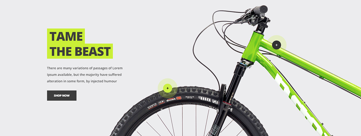
Different images for mobile and desktop
Hotspots widget have separate position options for mobile what allows you to use image with different proportions on mobile. You can see such example on our demo. We used long image for desktop and twice shorter on mobile to fit the screen better.
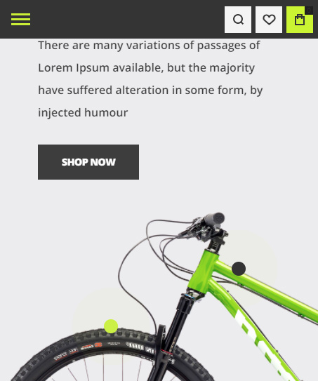
You can add two different images one after another and use theme classes hide-on-desktop hide-on-tablet hide-on-mobile to hide one image on mobile and show another instead. After that simply adjust hotspot positions for mobile in hotspot widgets.
Sample Code:
<div class="ox-hotspot__container">
<img src="{{media url="wysiwyg/bike-bg.jpg"}}" class="hide-on-mobile" alt="" style="min-height: 500px;"/>
<img src="{{media url="wysiwyg/bike-bg-mobile.jpg"}}" class="hide-on-desktop hide-on-tablet" alt="" />
{{widget type="Olegnax\HotSpotQuickview\Block\Widget\HotSpot" id_path="product/2185" position_left="75" position_top="36" height="44" width="44" color="#ffffff" shadow="0" color_background="#333333" pulse_animation="1" pulse_animation_color="#caef38" border_color="" icon="plus-small" border_radius="" hide_mobile="0" mobile_minimized="1" position_left_m="" position_top_m="32" tooltip_content="1" tooltip_text="" tooltip_static="ox-hotspot-running-man-02" tooltip_width="260" tooltip_color="white" tooltip_color_background="#3f3f3f"}}
{{widget type="Olegnax\HotSpotQuickview\Block\Widget\HotSpot" id_path="product/2185" position_left="47" position_top="66" height="44" width="44" color="#000000" shadow="0" color_background="#caef38" pulse_animation="1" pulse_animation_color="#caef38" border_color="" icon="plus-small" border_radius="" hide_mobile="0" mobile_minimized="1" position_left_m="35" position_top_m="62" tooltip_content="1" tooltip_text="" tooltip_static="ox-hotspot-bike-01" tooltip_width="210" tooltip_color="" tooltip_color_background=""}}
</div>
Import Sample Page
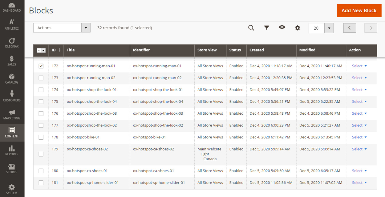
You can import sample page with hotspots and also used in it static blocks via Athete2 > Demo Import
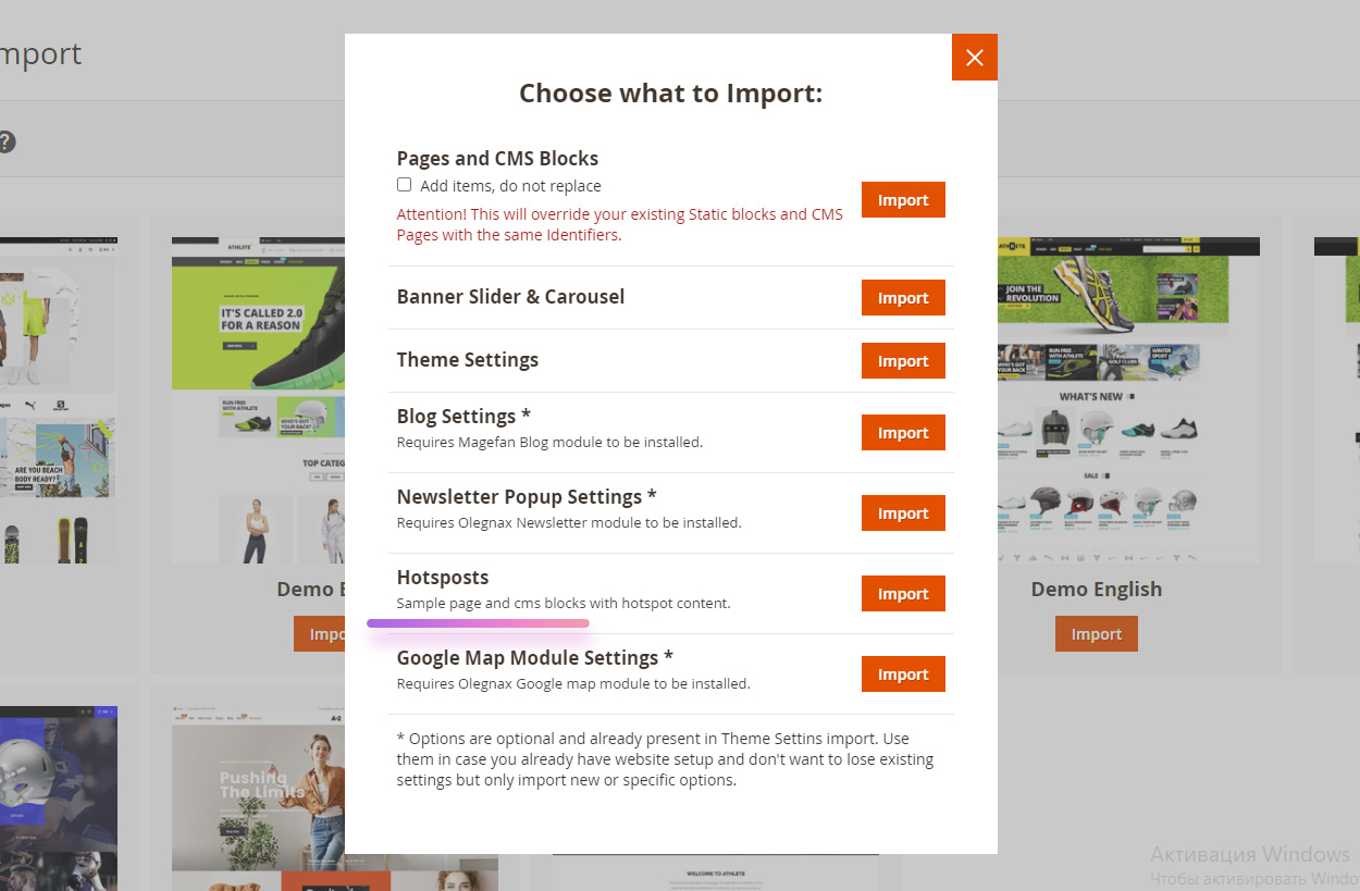
This will create static blocks in Content / Blocks used as tooltip content for some of the hotspots.
{{widget type="Olegnax\HotSpotQuickview\Block\Widget\HotSpot" id_path="product/2185" position_left="47" position_top="66" height="44" width="44" color="#000000" shadow="0" color_background="#caef38" pulse_animation="1" pulse_animation_color="#caef38" border_color="" icon="plus-small" border_radius="" hide_mobile="0" mobile_minimized="1" position_left_m="35" position_top_m="62" tooltip_content="1" tooltip_text="" tooltip_static="ox-hotspot-bike-01" tooltip_width="210" tooltip_color="" tooltip_color_background=""}}
and a page (Content / Pages) with url key hotspots. You can reach it via following link https://yourwebsite.com/hotspots