


Table of Contents
Hotspots:
- Hotspot Widget Settings
- Hotspot Click Action
- Basic Hotspot Settings
- Hotspot Mobile Settings
- Hotspot Tooltip
Quickview:
- Quickview General Settings
- How to remove 3rd party extension blocks
- Quickview Modal Appearance
- Quickview Modal Paddings
Installation Information
Module Name: Olegnax_HotSpotQuickview
Module Path: app/code/Olegnax/HotSpotQuickview
Check this article to learn how to install Magento 2 extensions.
iThis extension require Olegnax Core module to be installed. Core module can be installed both Manually and via Composer.
iPlease note that Olegnax HotSpotQuickview, Quickview and Core modules are already packed with Athlete2 – Strong Magento 2 Theme, so you don’t need to install it if you use our theme.
Quick installation guide:
- Copy Olegnax Quickview Hotspots Extension archive to the root of your Magento folder and extract it.
- 3 extensions will be extracted to app/code/Olegnax folder: Core, Quickview, HotSpotQuickview. Set correct files owner and permissions.
- Log in to your server with SSH, navigate to Magento 2 folder and run following commands:
php bin/magento setup:upgrade
php bin/magento setup:di:compile
php bin/magento setup:static-content:deploy
That’s it. Now your extension should be installed and enabled.
Detailed instructions – How to install Magento 2 extensions.
Overview
This extension is a combination of following extensions: Quickview and HotSpotsQuickview. HotSpotsQuickview allows to add hotspots to images (or any content block) using a widget. When you click on hotspot it opens linked product in quickview modal, but you can also choose other actions (more details below). HotSpotsQuickview requires Olegnax Quickview extension it to be installed in order to be able to open modals on click.
You can add tooltips on hover with html content. Adjust hotspot and tooltip colors and size, add text to hotspot or show only icon. Minimize hotspots on mobile and more.
Hotspots
How to add Hotspot Widget
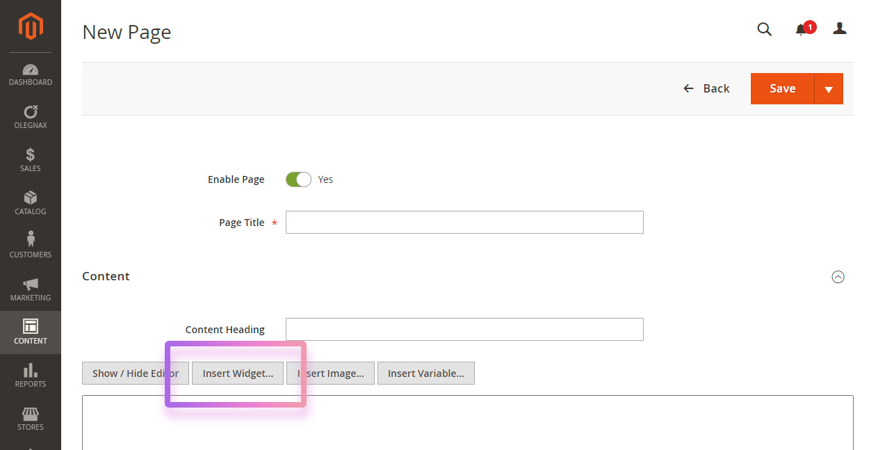
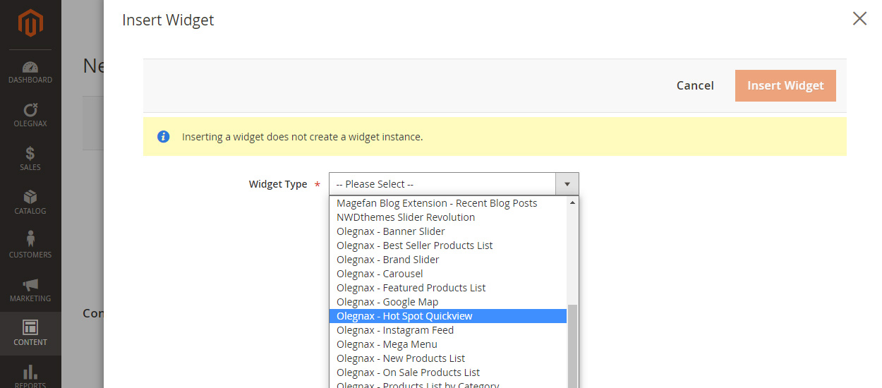
To add hotspot widget simply click in Insert Widget button when you edit page or any other content that allows to add widgets (e.g. Carousel Slider).
Choose Olegnax – Hot Spot Quickview and adjust widget settings.
Hotspot Widget Settings
Hotspot Click Action
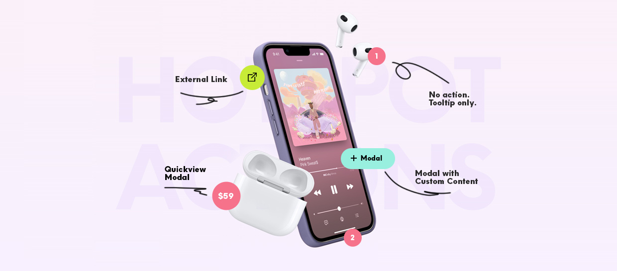
First of all we need to choose a click action for hotspot – Hotspot Action/Content Source.
Following options are available:
None – nothing happens when you click on hotspot. Use this if you simply want to add some additional information to the image/content block e.g. focus on some product features.
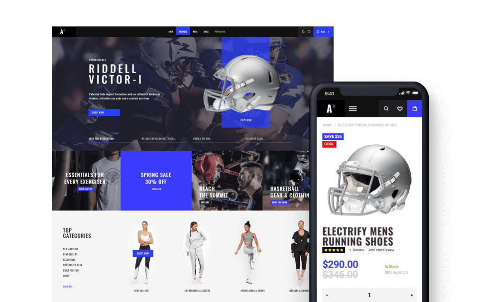
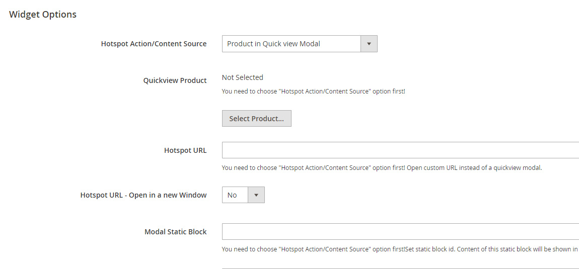
Product in Quickview Modal – choose this option if you want to open quickview modal on hotspot click. After you selected this option, click Select Product button in Quickview Product option below and choose product.
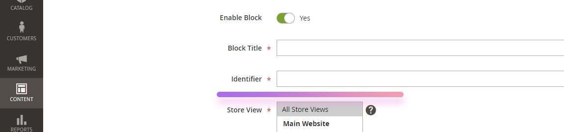
Static Block – choose this if you want show custom content in a modal. After you selected this option, type static block Identifier in Modal Static Block field.
Navigate to Content/Blocks, choose or add new block and copy Identifier field.
Open URL – this option allows to add any custom link on hotspot click. After you selected this option, add url to Hotspot URL field. Note that you can also choose to open link in a new window.
Basic Hotspot Settings
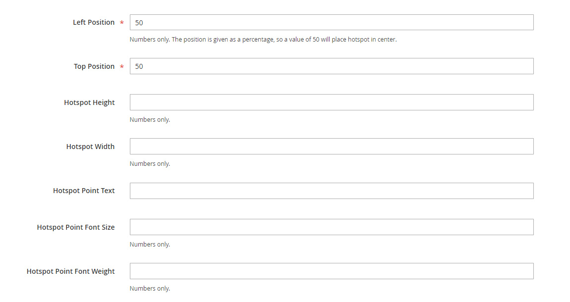
Left and Right Position – this is the position relatively to the parent element (wrapper). Position set in % in order to be responsive. By default it is set to the center (50%,50%) of the wrapper.
Hotspot Height and Width – hotspot have fixed height and width. by default it is 38px. You need to adjust it if you want to add text in it.
Hotspot Point Text – this option allows to add text inside of the hotspot.
You can also adjust hotspot text font size and font weight.
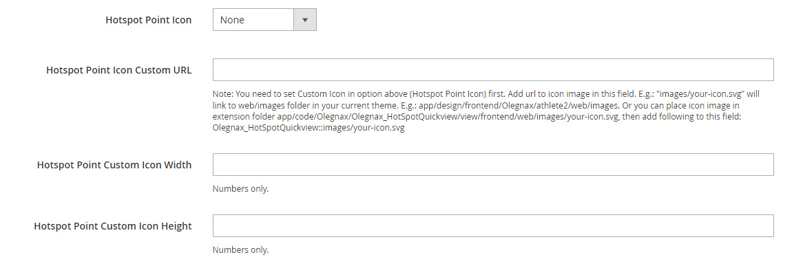
Hotspot Point Icon – you can choose from predefined hotspot icon or your own custom image.
If you selected custom image, then you need to upload it either to your theme or extensions folders:
- If you add following path to Hotspot Point Icon Custom URL:
images/your-icon.svgit will link to web/images folder in your current theme. E.g.: app/design/frontend/Olegnax/athlete2/web/images. - Or you can place icon image in extension folder: app/code/Olegnax/Quickview/view/frontend/web/images/your-icon.svg, then add following line to Hotspot Point Icon Custom URL field:
Olegnax_Quickview::images/your-icon.svg
You may need to set width and height for your custom image, especially if it is an .svg. Some .svg icons don’t have defined sizes and so its width and height will be 0 by default.
Hotspot Shape Radius – you can change hotspot shape from square to circle. Set 0 for square hotspot. Set half of the hotspot width for fully rounded sides. E.g. to make circle hotspot set width and height to 38px and shape radius to 38/2 = 19px.
Pulse Animation – adds pulsating circle behind the hotspot.
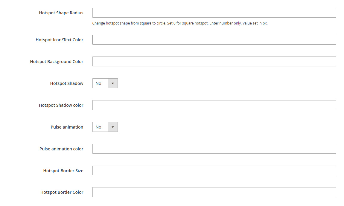
And you can also set various hotspot point color options such as text, shadow, border color, etc.
Hotspot Mobile Settings
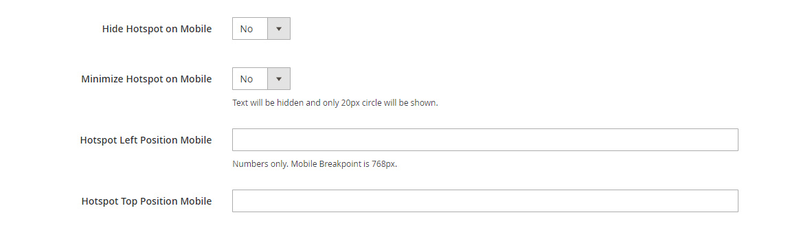
Hide Hotspot on Mobile – you can hide hotspot on mobile if it doesn’t play well with other content on small screen.
Minimize Hotspot on Mobile if its too big for mobile or you have multiple hotspots overlapping. This option will make hotspots as small dots with no text or icons inside.
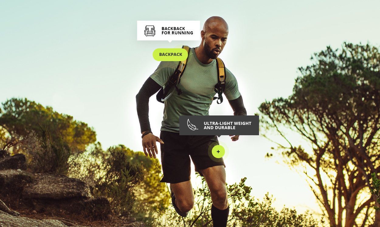
Below example of minimized hotspots on mobile and some not.
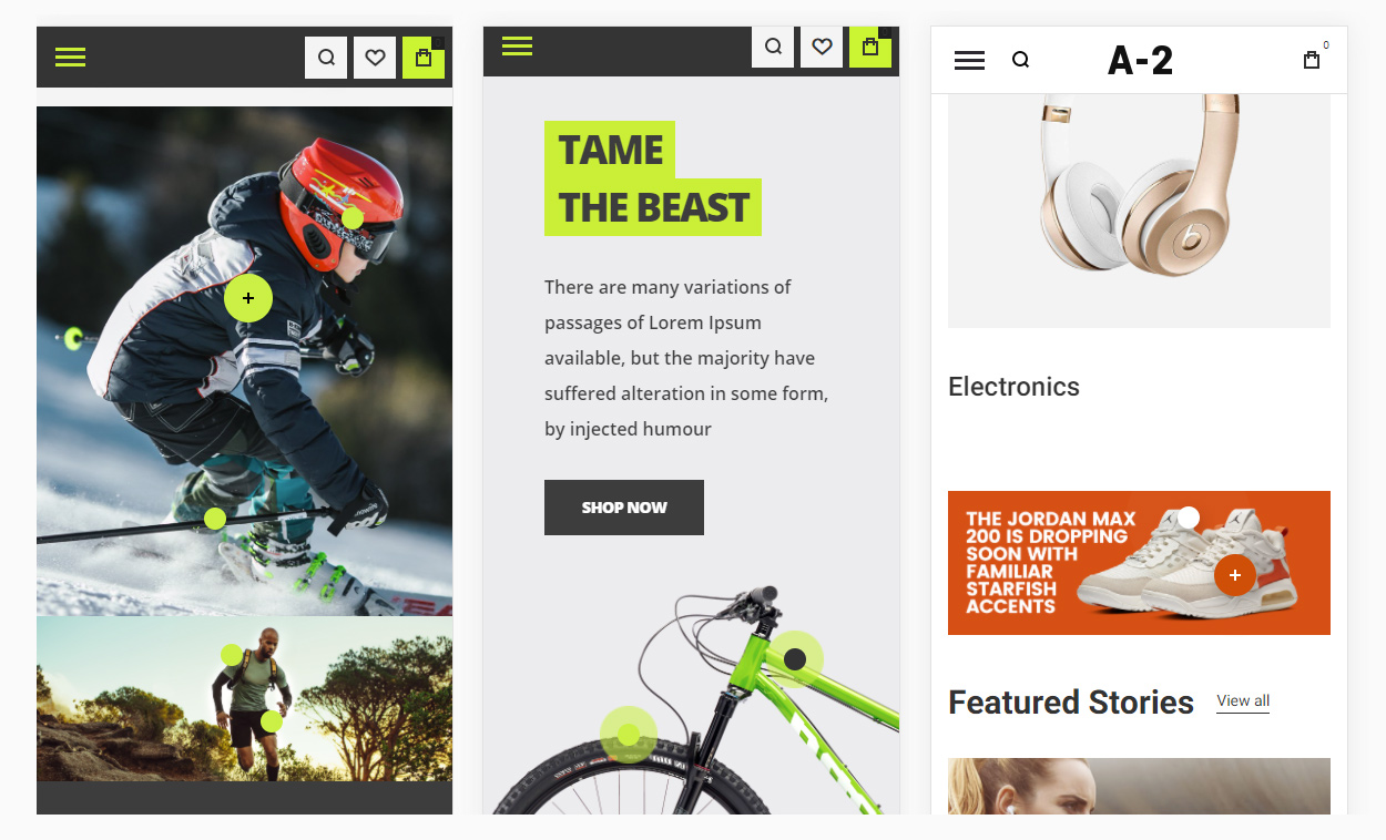
Hotspot Left / Top Position Mobile – you can use different image for mobile and set different hotspot position for small viewport size. Or simply adjust hotspots position if they became too close to each other on mobile.
Hotspot Tooltip
When you click on tooltip it opens Quickview modal but you can also add text or any html content which will be shown on hover.
You can either add simple text or set static block as source of tooltip content, where you can add images and html tags.
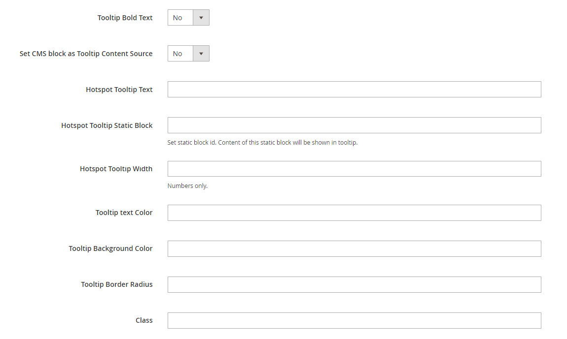
Set CMS block as Tooltip Content Source – this option allows you to show html content in hotspot tooltip via cms blocks (Content / Blocks). After it is enabled set cms block id in Hotspot Tooltip Static Block field.
Hotspot Tooltip text – use this option if you only want to show simple text in hotspot tooltip. Note that some symbols should be converted to ascii code in this field. E.g.: dollar sign $ should be $ so $56 will be $px;56
Tooltip Bold Text – this option will set font weight 700 to tooltip text.
And of course, you can adjust tooltip width and colors.
Class – allows to add custom class to tooltip. Use it if you wish to add some more changes to hotspot or simply style it via CSS so you don’t need to configure these settings for each hotspot.
Hotspot on Images
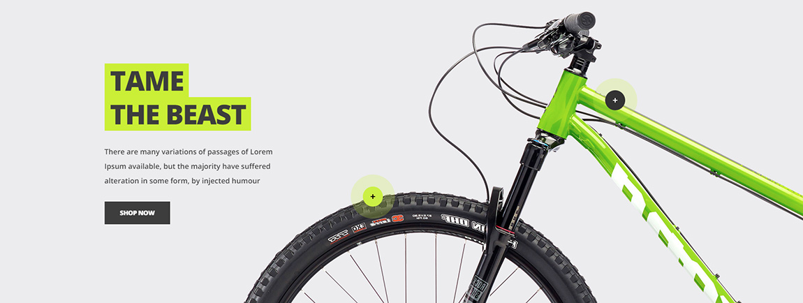
You can add Hotspot widget anywhere(where it is possible to add a widget) but it requires parent element to have position “relative” and image width should be set to 100% so it is same as parent element in order to correctly positioning hotspot on image.
To achieve this we can simply wrap our image and hotspot in div element with ox-hotspot__container class. Hotspot should be added after image. See example below:
<div class="ox-hotspot__container">
<img src="{{media url="wysiwyg/bike-bg-mobile.jpg"}}" />
{{widget type="Olegnax\HotSpotQuickview\Block\Widget\HotSpot" click_action="product" id_path="product/1" position_left="75" position_top="36" height="44" width="44" color="#ffffff" shadow="0" color_background="#333333" pulse_animation="1" pulse_animation_color="#caef38" border_color="" icon="plus-small" border_radius="" hide_mobile="0" mobile_minimized="1" position_left_m="" position_top_m="32" tooltip_content="1" tooltip_text="" tooltip_static="ox-hotspot-running-man-02" tooltip_width="260" tooltip_color="white" tooltip_color_background="#3f3f3f"}}
</div>
* This wrapper is not required if you add hotposts to Olegnax Carousel Slider. Simply add it in content. However note that hotspot positioning will only be accurate if slider height depends on Image.
Different images for mobile and desktop
Hotspots widget have separate position options for mobile what allows you to use image with different proportions on mobile. You can see such example on our demo. We used long image for desktop and twice shorter on mobile to fit the screen better.
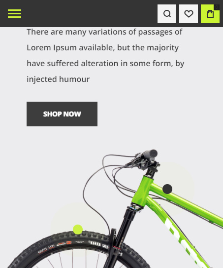
You can add two different images one after another and use theme classes hide-on-desktop hide-on-tablet hide-on-mobile to hide one image on mobile and show another instead. After that simply adjust hotspot positions for mobile in hotspot widgets.
Sample Code:
<div class="ox-hotspot__container">
<img src="{{media url="wysiwyg/bike-bg.jpg"}}" class="hide-on-mobile" alt="" style="min-height: 500px;"/>
<img src="{{media url="wysiwyg/bike-bg-mobile.jpg"}}" class="hide-on-desktop hide-on-tablet" alt="" />
{{widget type="Olegnax\HotSpotQuickview\Block\Widget\HotSpot" id_path="product/2185" position_left="75" position_top="36" height="44" width="44" color="#ffffff" shadow="0" color_background="#333333" pulse_animation="1" pulse_animation_color="#caef38" border_color="" icon="plus-small" border_radius="" hide_mobile="0" mobile_minimized="1" position_left_m="" position_top_m="32" tooltip_content="1" tooltip_text="" tooltip_static="ox-hotspot-running-man-02" tooltip_width="260" tooltip_color="white" tooltip_color_background="#3f3f3f"}}
{{widget type="Olegnax\HotSpotQuickview\Block\Widget\HotSpot" id_path="product/2185" position_left="47" position_top="66" height="44" width="44" color="#000000" shadow="0" color_background="#caef38" pulse_animation="1" pulse_animation_color="#caef38" border_color="" icon="plus-small" border_radius="" hide_mobile="0" mobile_minimized="1" position_left_m="35" position_top_m="62" tooltip_content="1" tooltip_text="" tooltip_static="ox-hotspot-bike-01" tooltip_width="210" tooltip_color="" tooltip_color_background=""}}
</div>
List of hotspot widget options:
| Option name | Values |
|---|---|
| click_action | product, custom, url, or leave it empty. E.g. click_action=”” |
| hotspot_url | URL, e.g. https://olegnax.com |
| hotspot_url_target | 0 or 1 |
| modal_custom_content | Text value. Cms block identifier. |
| position_left | Number |
| position_top | Number |
| height | Number |
| width | Number |
| label_text | Text value. |
| label_font_size | Number |
| label_font_weight | Number |
| icon | plus, plus-small, custom or leave it empty. E.g. icon=”” |
| icon_custom | Text value. Path to your icon image, e.g. images/icon.svg |
| icon_custom_width | Number |
| icon_custom_height | Number |
| border_radius | Number |
| color | Color hex or rgba/rgba value, e.g. #ffffff or rgba(255,255,255,1) |
| color_background | Color hex or rgba/rgba value, e.g. #ffffff or rgba(255,255,255,1) |
| shadow | 0 or 1 |
| shadow_color | Color hex or rgba/rgba value, e.g. #ffffff or rgba(255,255,255,1) |
| pulse_animation | 0 or 1 |
| pulse_animation_color | Color hex or rgba/rgba value, e.g. #ffffff or rgba(255,255,255,1) |
| border_size | Number |
| border_color | Color hex or rgba/rgba value, e.g. #ffffff or rgba(255,255,255,1) |
| hide_mobile | 0 or 1 |
| mobile_minimized | 0 or 1 |
| position_left_m | Number |
| position_top_m | Number |
| tooltip_bold_text | Text value. |
| tooltip_content | 0 or 1 |
| tooltip_text | Text value. |
| tooltip_static | Text value. Cms block identifier. |
| tooltip_width | Number |
| tooltip_color | Color hex or rgba/rgba value, e.g. #ffffff or rgba(255,255,255,1) |
| tooltip_color_background | Color hex or rgba/rgba value, e.g. #ffffff or rgba(255,255,255,1) |
| tooltip_border_radius | Number |
| custom_class | Text value |
Import Sample Page – Athlete 2 Theme only
You can import sample page with hotspots and also used in it static blocks via Athete2 > Demo Import
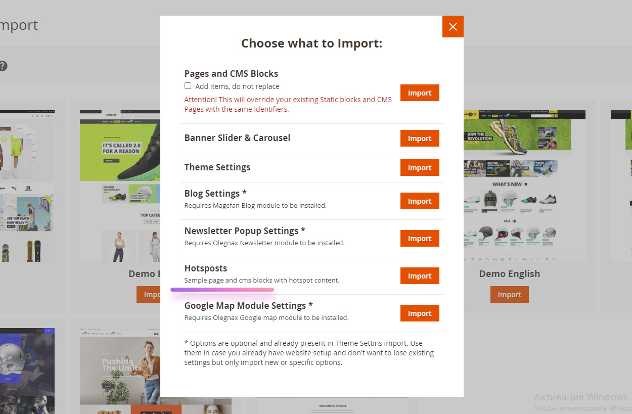
This will create static blocks in Content / Blocks used as tooltip content for some of the hotspots.
{{widget type="Olegnax\HotSpotQuickview\Block\Widget\HotSpot" id_path="product/2185" position_left="47" position_top="66" height="44" width="44" color="#000000" shadow="0" color_background="#caef38" pulse_animation="1" pulse_animation_color="#caef38" border_color="" icon="plus-small" border_radius="" hide_mobile="0" mobile_minimized="1" position_left_m="35" position_top_m="62" tooltip_content="1" tooltip_text="" tooltip_static="ox-hotspot-bike-01" tooltip_width="210" tooltip_color="" tooltip_color_background=""}}
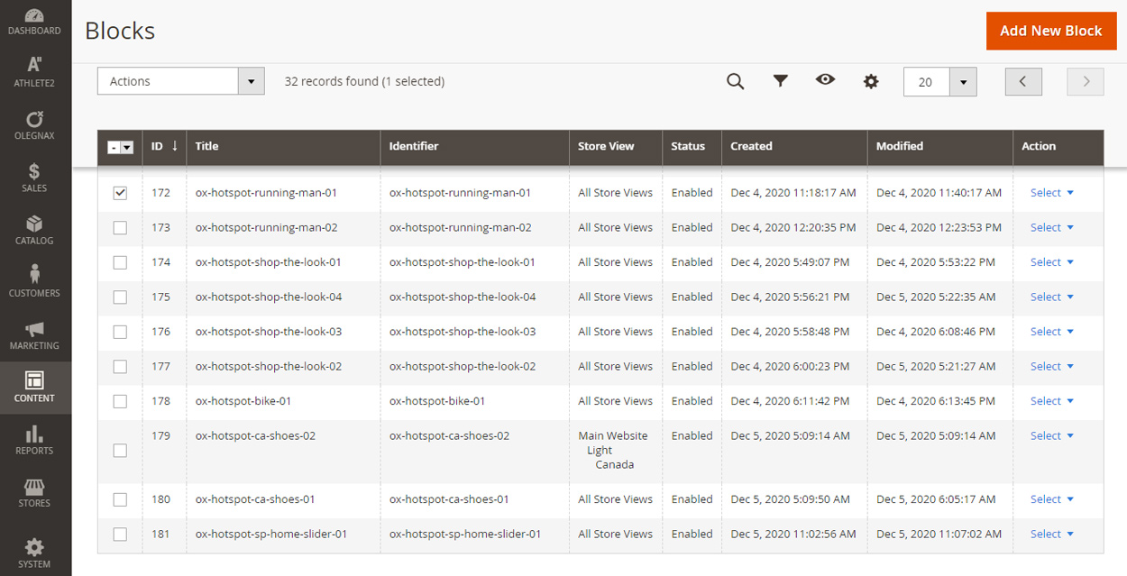
and a page (Content / Pages) with url key hotspots. You can reach it via following link https://yourwebsite.com/hotspots
Quickview
Quickview extension bundled with HotspotQuickview extensions loads entire product page inside of a modal.
Since it load entire product page it may load block that you don’t want to see in a modal. We have disabled default Magento block like breadcrumbs, footer, header, etc and also added options to allow you enable disable some blocks in a quickview modal.
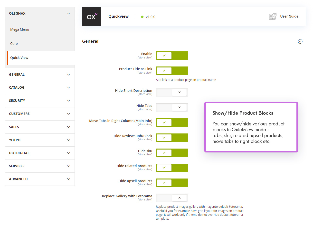
Quickview General Settings
You can find Quickview extension settings in Olegnax / Quickview: Configuration
In General tab of quickview settings you can choose what product blocks to show in quickview modal. Also you can move tabs to the right side, in info block instead of its default position below the info and media blocks.
Additionally you can try to force replace product images gallery with magento default fotorama in quickview. This can be useful if lets say your theme have grid gallery instead of carousel on product page.
How to remove 3rd party extension blocks
If you install some extensions, which adds content to a product page you may also need to remove it from quickview. To do this you will need to add remove record to xml files in app/code/Olegnax/Quickview/view/frontend/layout/. Default one is ox_quickview_catalog_product_view.xml
To do this you need to know block name and add record like this (change your_block_name to the actual block name):
<referenceBlock name="your_block_name" remove="true"/>
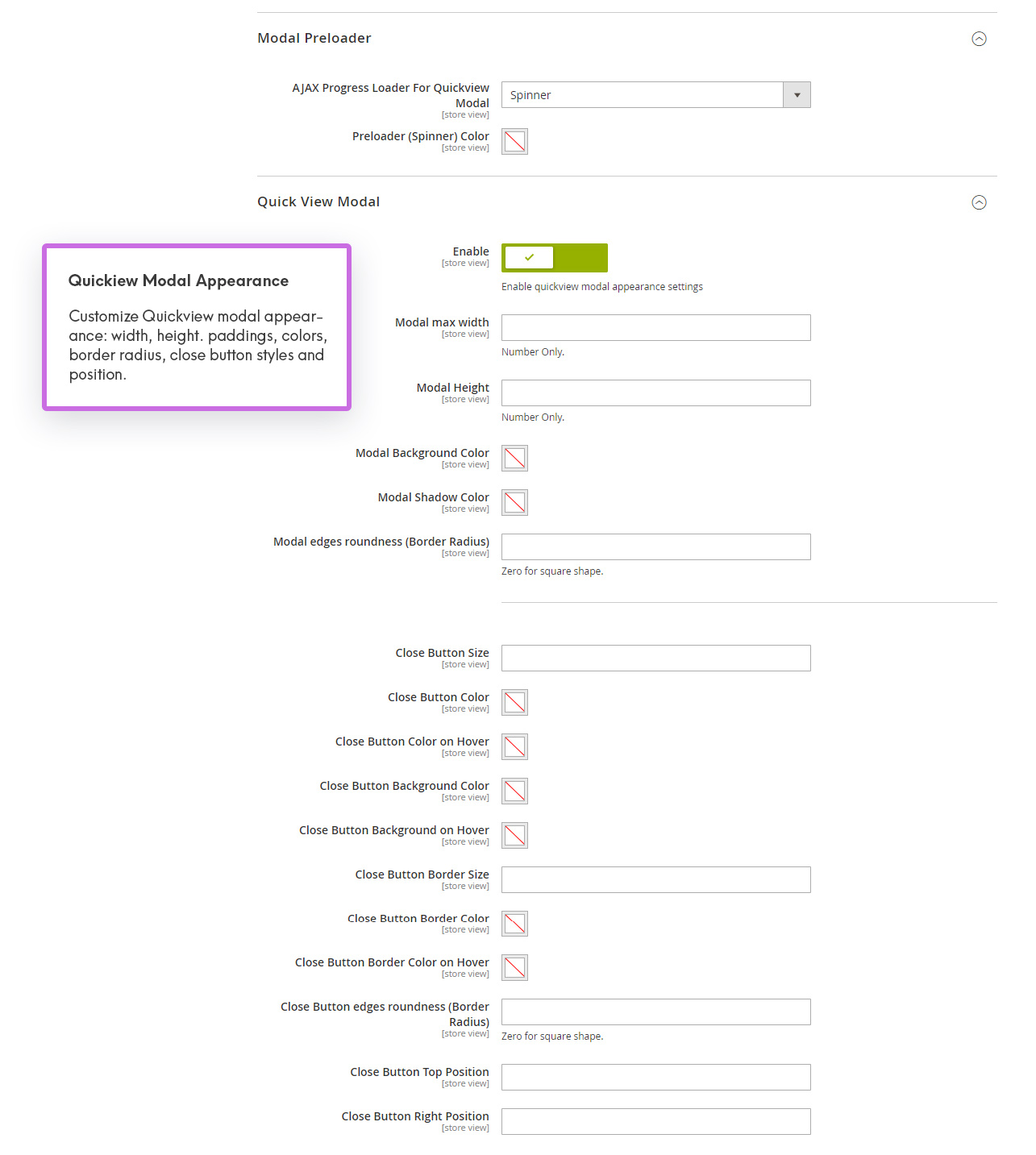
Quickview Modal Appearance
Modal Preloader – You can choose from predefined loaders, use default loader or upload your custom loader image. Including svg. Same as for custom hotspot icon.
If you selected custom image, then you need to upload it either to your theme or extensions folders:
- If you add following path to Hotspot Point Icon Custom URL:
images/your-preloader.svgit will link to web/images folder in your current theme. E.g.: app/design/frontend/Olegnax/athlete2/web/images. - Or you can place preloader image in extension folder app/code/Olegnax/Quickview/view/frontend/web/images/your-preloader.svg, then add following to Hotspot Point Icon Custom URL field:
Olegnax_Quickview::images/your-preloader.svg
Modal Max Width – as you understand you can set modal max width and height. Modal is responsive and so its widht will never be bigger than the screen width, no matter what width value you will set.
Additionally you can set modal background and shadow colors and adjust appearance of a close button to fit your theme style.
Quickview Modal Paddings
You caYou can adjust paddings for various blocks in quickview modal separetly for desktop, tablet and mobile screen resolutions. We’ve marked padding zone with different color to make it easier for you to understand what will be affected by each padding options group.
Padding is set in css format. If you are not familiar with css, you can add padding as a single value, e.g.: 30px. Including px! Or you can add 4 numbers if you want to set different padding value for each side. E.g.: 50px 40px 0 30px will set 50px to top, 40px to right, 0 to bottom and 30px to the left side. So top, right, bottom, left.
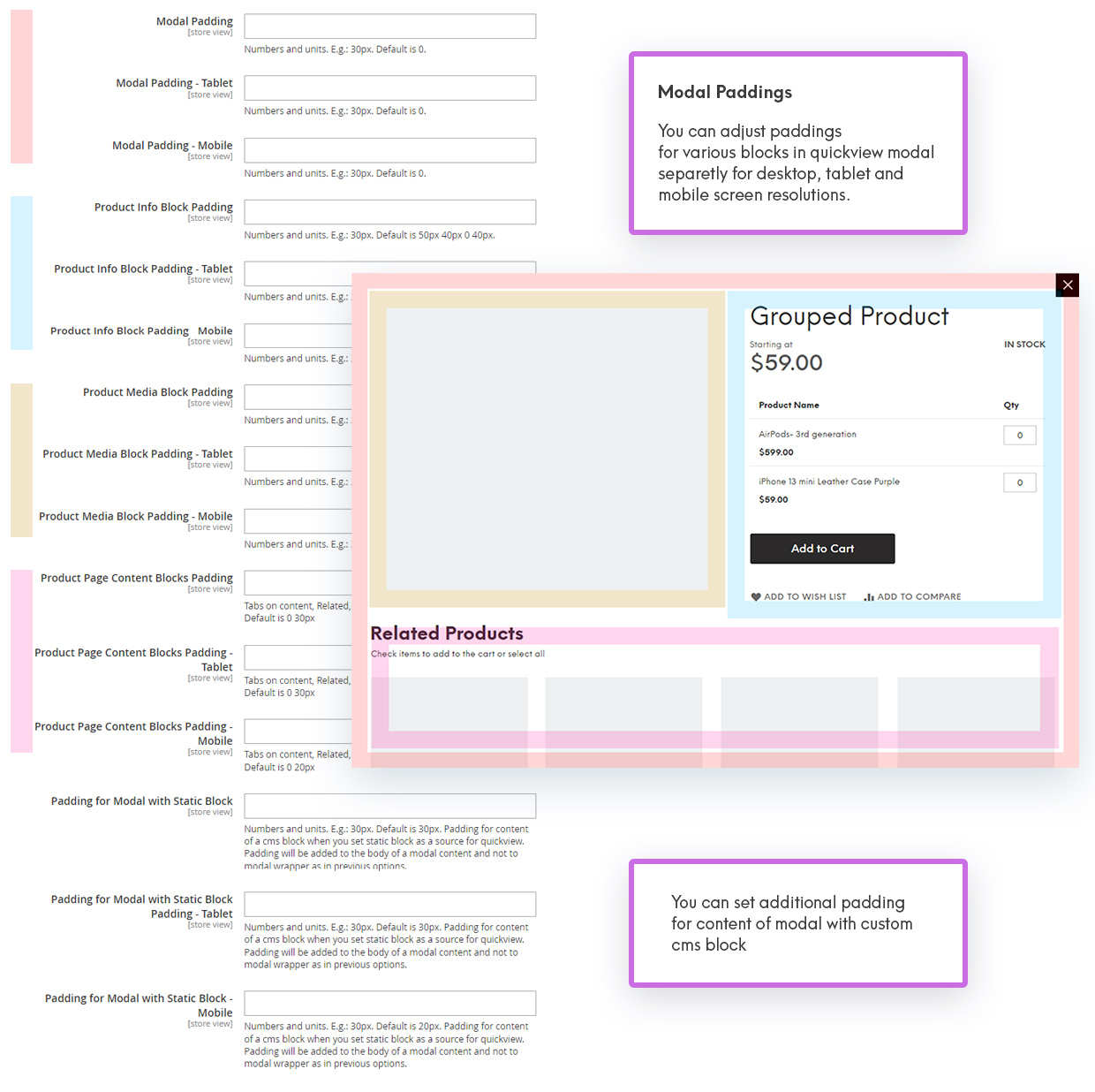
There is also additional padding options for content of a custom cms block in a quickview modal. It will not change the modal paddings but will be added inside of the modal to your content. So if you have modal with 30px padding and also add 30px padding to Static block, you will have 60px padding in total. So keep in mind that is add and not override the padding value.