


Installation Information
Module Name: Olegnax_NewsletterPopupBasic
Module Path: app/code/Olegnax/NewsletterPopupBasic
Check this article to learn how to install Magento 2 extensions.
iThis extension require Olegnax Core module to be installed. Core module can be installed both Manually and via Composer.
iPlease note that both Olegnax Newsletter Popup and Core modules are already packed with Athlete2 – Strong Magento 2 Theme, so you don’t need to install it if you use our theme.
Overview
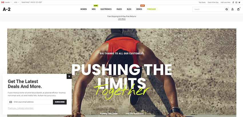
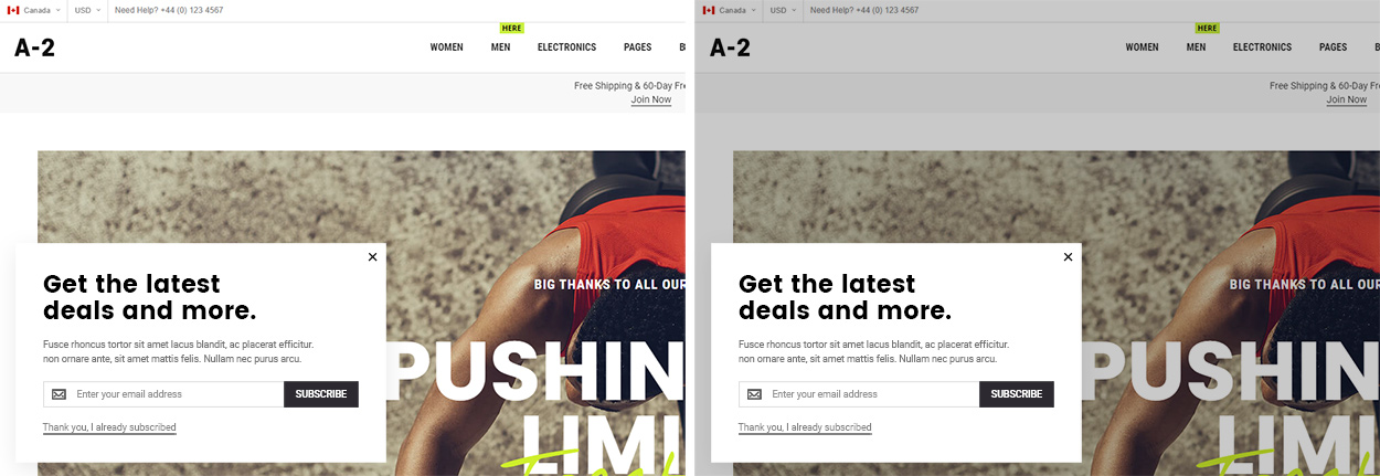
While this extension is called newsletter popup it is basically a just a popup with custom content. You can add anything in the content of this popup, not only the newsletter form. You can use it for example to inform you website visitor about current discounts, promotions, provide discount code or simply as a welcome message. We’ve made a few design examples of this popup used as banners. You can find it in PSD folder of the main package.
Extension Settings
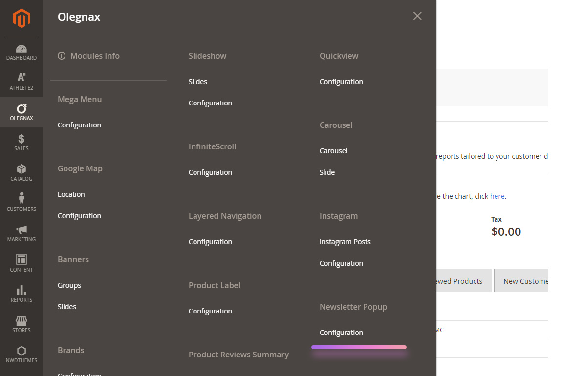
You can find Magento 2 Newsletter Popup Extension settings in Olegnax menu on the left in your Magento 2 admin panel: Olegnax > Newsletter Popup> Configuration.
General Settings
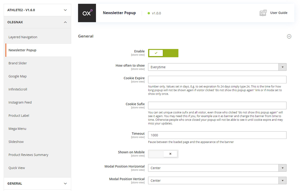
Enable – enable/disable newsletter popup. This option doesn’t disable extension but only do not show the popup. If you don’t use some of the extension it is always better to disable them completely, via cli: How to Uninstall Magento 2 Extension
How often to show – you can choose to show popup only on the first visit, on every visit or randomly.
Cookie Expire – This is the time for how long popup will not be shown again if visitor clicked “Do not show this popup again” link or if How often to show option set to show only once. Values are set in days. E.g. to set expiration for 24 days simply type 24.
Cookie Suffix – You can set unique cookie suffix and all visitors, even those who clicked “Do not show this popup again” will see it again. You may need this if you, for example use popup as banner and change this banner from time to time. Otherwise people who once closed (“Do not show this popup again”) your popup will not be able to see it again until cookie expires and may miss your promotions.
Timeout – this option adds delay to popup appear after page is loaded. You can for example show popup after visitor spent some time on the page.
Show on mobile – don’t show popup when viewport size is below 1024px. Useful for massive popups which can’t be done properly responsive.
Modal Position Horizontal and Modal Position Vertical – allows you to control position of you popup on the screen. Below you can see example of popup on the bottom left and centered.
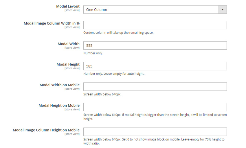
Modal Sizes
The next set if options allows to control sizes of popup and its content layout.
You can set Modal Width and Modal Height separately for desktop and small Mobile screens (Below 640px).
Please note that Modal Height is optional, if you leave it empty it will depends on modal content (Recommended). We suggest to set modal height only if you need to limit the height of modal e.g. so it don’t stretch background image. In this case if the content height is greater then scroll will appear.
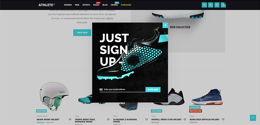
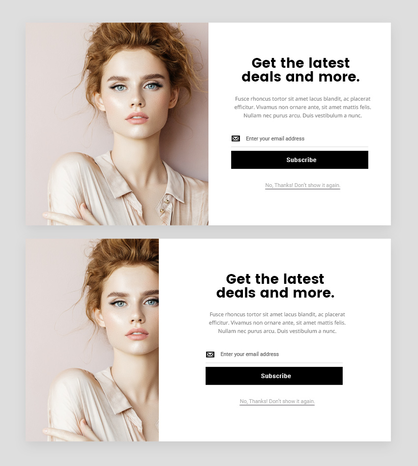
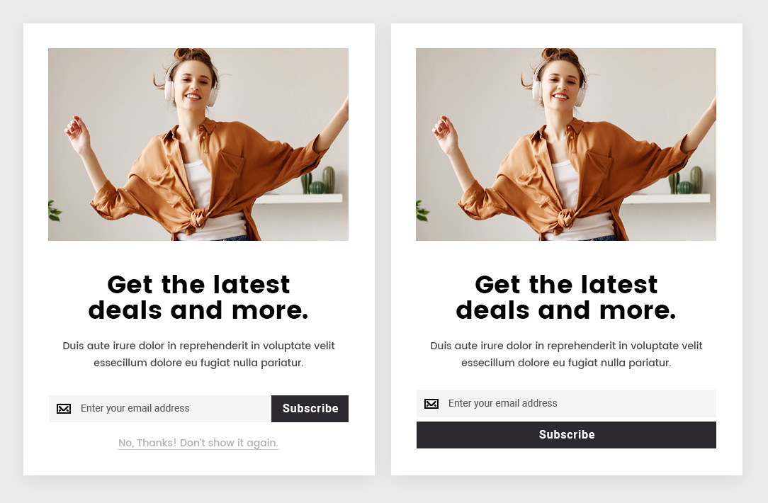
Modal Layout – You can choose between One and Two columns layout. When One Columns selected content cover the whole popup area. When Two Columns selected popup divided to two columns: content and image.
Modal Image Column Width in % – by default image and content in two columns take 50% of popup each. But you can change image/content width ratio. If you set Image Columns width to 30% content will take the rest – 70%. Below example of popup with 50/50 and 30/70 image/content ratio:
Modal Image Column Height on Mobile – On mobile columns will jump one above another so you may need to adjust image height on mobile, in case you use two columns layout.
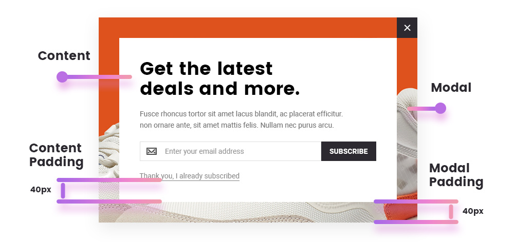
Modal Paddings
You can set paddings for modal wrapper and modal content. Also these paddings can be adjusted for tablet (640 – 1024px) and mobile(below 640px) screen sizes.
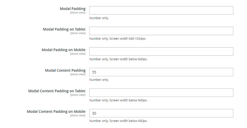
Modal Padding – is a space around the content area.
Modal Content Padding – space inside the content area.
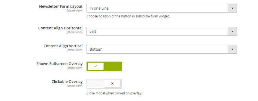
Newsletter Form Layout – choose to show input and button in one line or one above another.
Content Align Horizontal – align text in modal content area.
Content Align Vertical – this option only work if modal height is set and will vertically align whole content block in modal. See image below for examples.
Show Fullscreen Overlay – enable this option to block content with transparent overlay layer which will prevent website content from clicking.
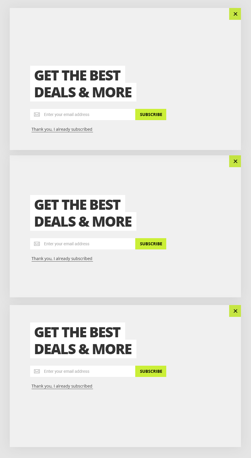
Clickable overlay – with this option enabled modal will be closed if you click on overlay behind the modal. See examples below (without and with overlay):
Content Settings
Modal Column Background Image – you can set image for second column if you have choose two columns modal layout.
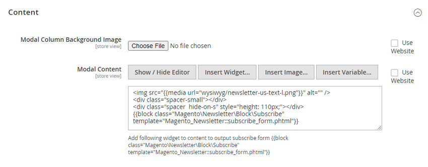
Modal Content – you can add any content here which will be shown in main column of newsletter popup.
Newsletter form
There is no built in newsletter form to provide better flexibility. You can add newsletter block in content using following code, if needed:
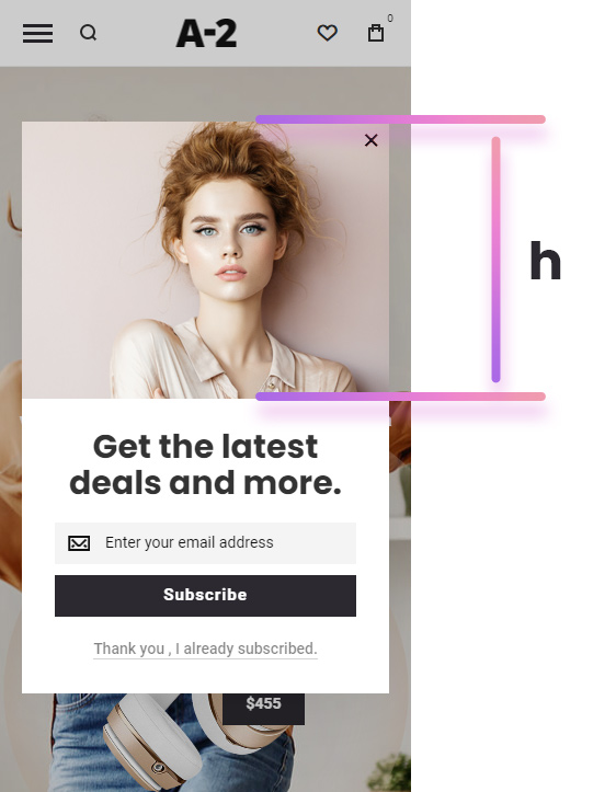
{{block class="Magento\Newsletter\Block\Subscribe" template="Magento_Newsletter::subscribe_form.phtml"}}Don’t show this popup again link
You can add link in content of modal which will close modal an will not show it again. To do this simply add ox-newsletter-disable__link class to the link, e.g.:
<a href="#" class="ox-newsletter-disable__link ox-grey-underline">Thank you , I already subscribed.</a>
Note the ox-grey-underline class. Use it to add underline to link and make it half-transparent, grey.
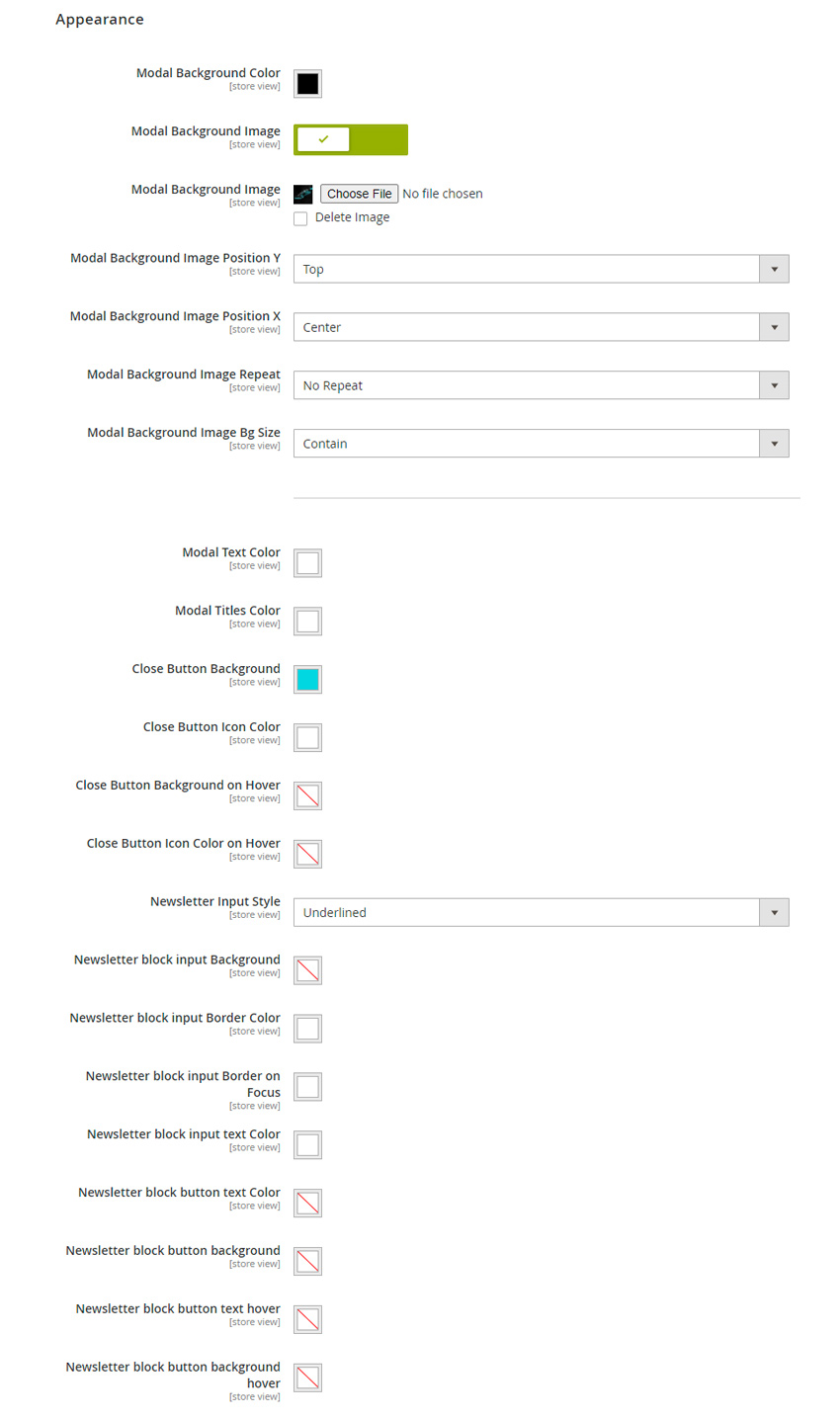
Appearance Settings
Here you can change modal background color and add background image to it. Adjust close button and subscribe form colors. You can also choose between normal(with background and borders around, if set) and underlined (transparent with only border on bottom) subscribe form input style.
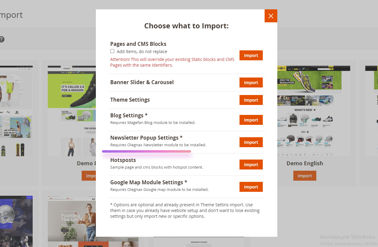
Import Sample Newsletter Popup Settings
Each demo comes with different example of newsletter. You can easily import newsletter settings from any demo independently from other demo settings in Athete2 > Demo Import